¶ Create InApp campaigns
EMMA provides you with different types of In-App communications to interact with your app users in the most effective way.
In this guide, we will explore in detail each available In-App format and learn how to create communications to impact app users.
To start creating your communication campaign, log in to EMMA and go to Communication > Messages.
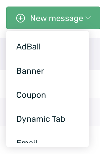
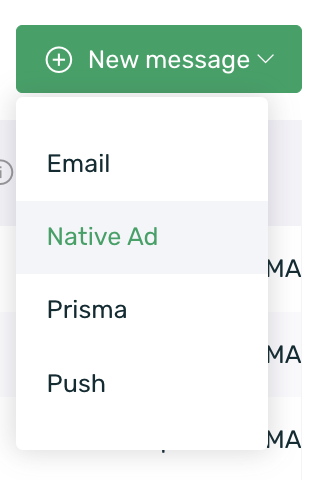
Click on the green +New Message button, located on the right side of the messages screen, to begin creating your campaign.
To create your campaign, follow these steps:
- Select the campaign type
- Define the format properties
- Choose the target audience
- Schedule the message
- Review and confirm the communication
Choose the communication format you will use in your campaign from the following options:
To learn more about each format, click on the corresponding name in the list above.
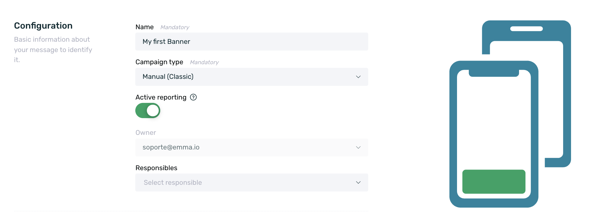
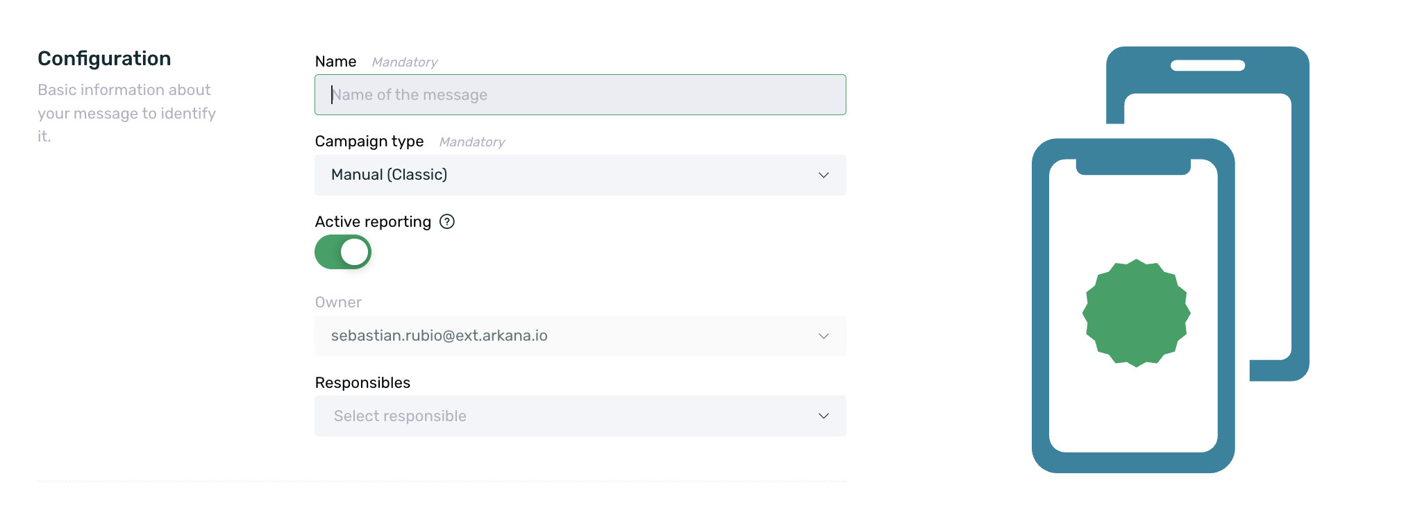
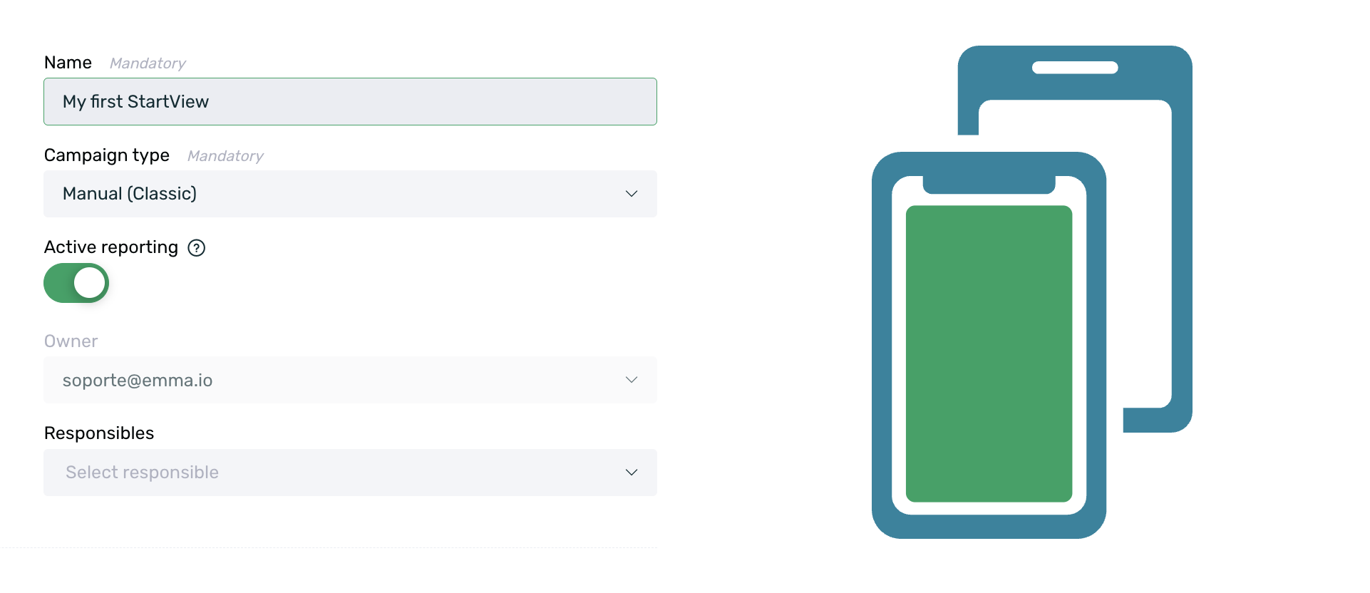
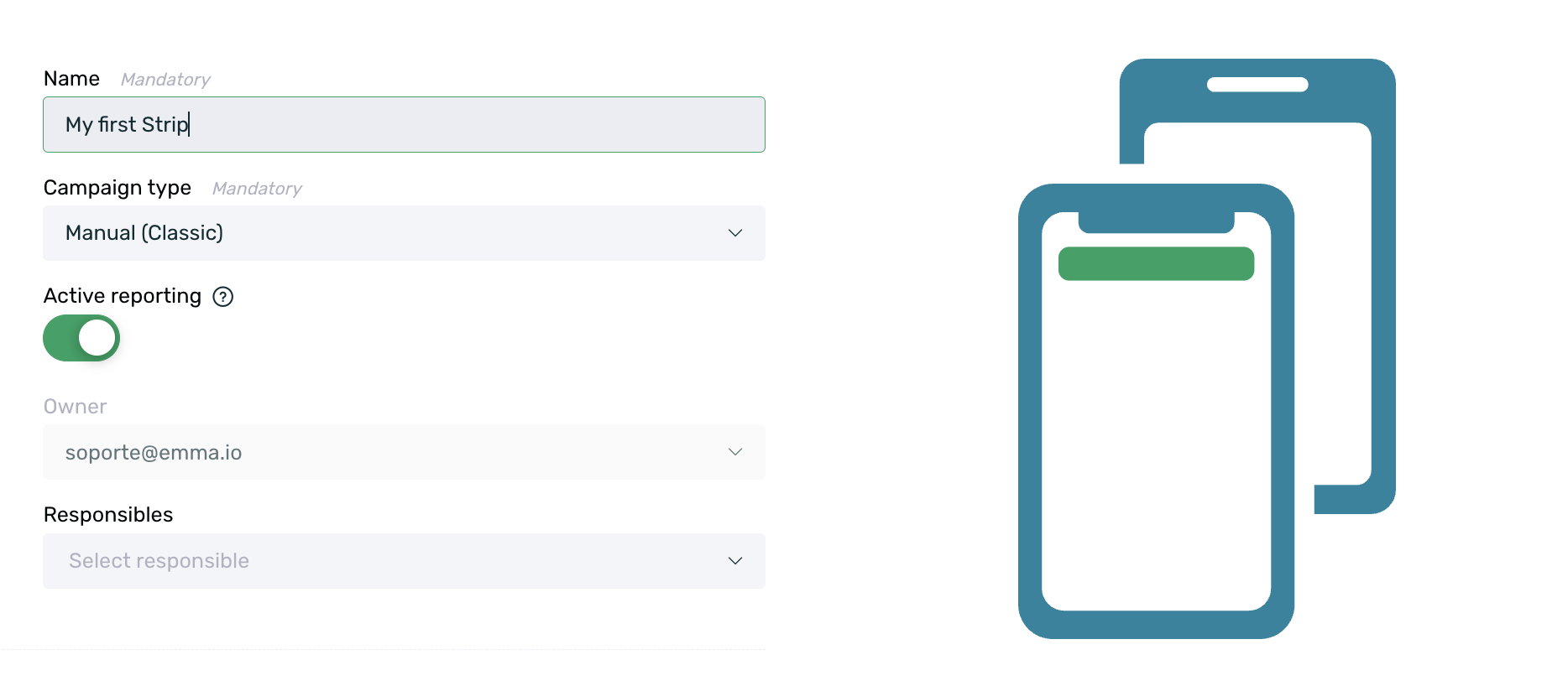
¶ Properties
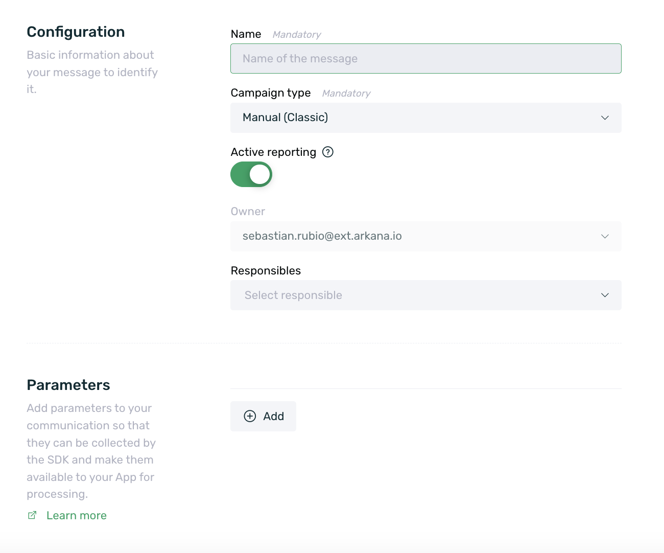
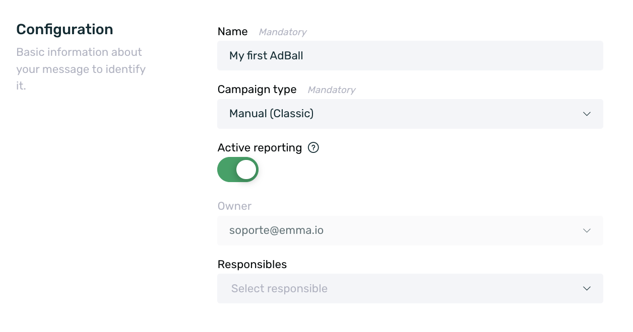
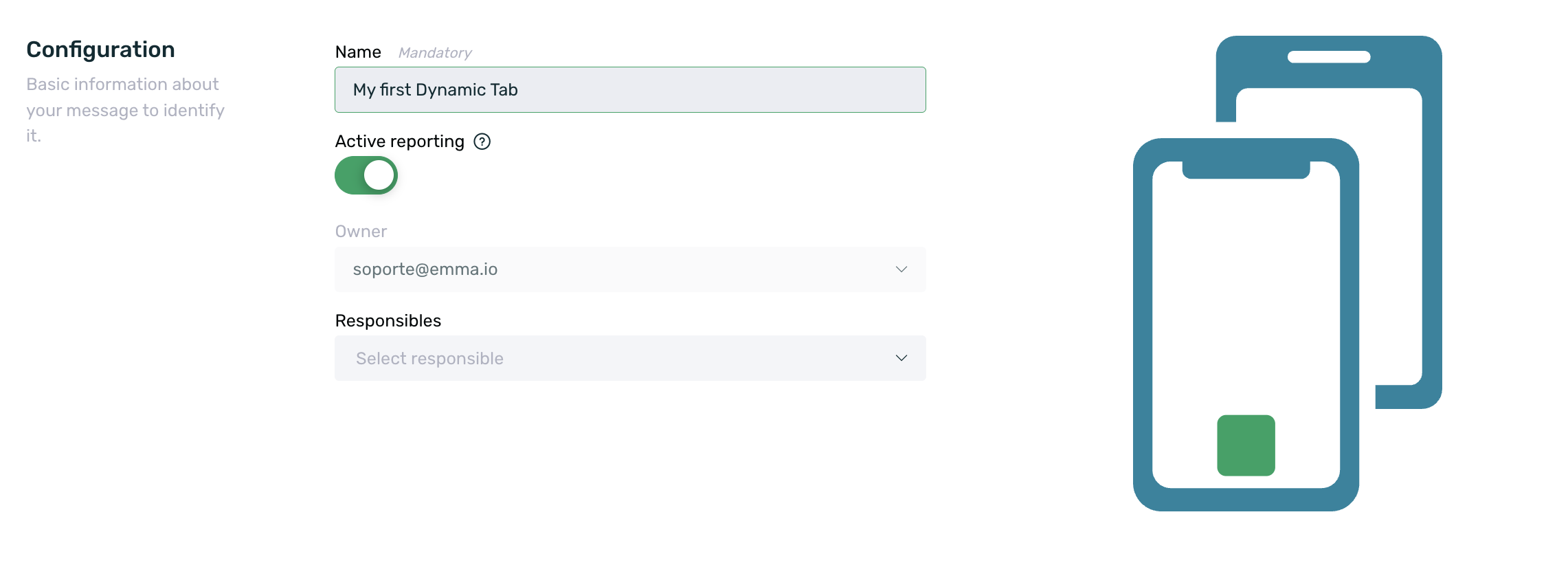
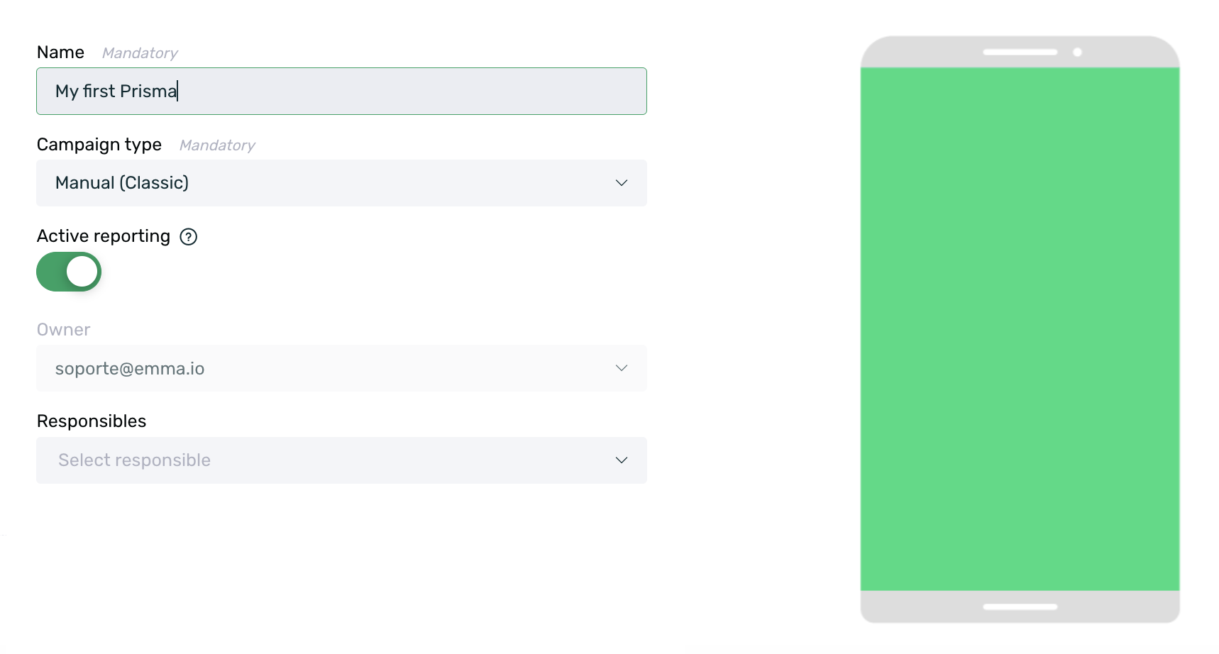
Once the format is selected, the communication creation form will automatically open. In the first section of the form (Properties), you will need to fill in the basic campaign information.
-
Name: Set a name for the campaign.
-
Campaign Type: Choose whether your campaign will be managed manually or automated through EMMA Rules or Customer Journeys:
- Classic: Manually managed campaign. A start and end date for the campaign is set in the following configuration steps.
- Automated for rules: Campaign automation with EMMA Rules. To learn more about this option, visit our article on Rules.
- Automated for customer journeys: Campaign automation with EMMA Customer Journeys. To learn more about this option, visit our article on Customer Journeys. This campaign type does not allow A/B test variations.
-
Active Reporting: Enabled by default. If enabled, this means that the data generated by this communication will be collected and available in the Communications Report section. If disabled, campaign data will not be collected and will not appear in reporting.
-
Owner: The campaign owner. By default, this is the user who creates it. This field applies only if campaign pre-validation roles are activated. You can find more information in our specific guide on campaign pre-validation.
-
Managers: Select the users responsible for this campaign. Only users with the Manager role can be responsible for a campaign. This field applies only if campaign pre-validation roles are activated. More details can be found in our guide on campaign pre-validation.
-
Categories: Select the category linked to the communication for saturation control. This is an optional field and can be left blank. More information about saturation control is available here.
-
Parameters: Two types of parameters can be configured:
-
Parameters collected by the SDK: Clicking the +Add button allows you to configure parameters that the SDK will collect, making them available to the app for further processing. Adding these parameters is entirely optional.
-
Parameters for filtering in the performance report: If specific communication parameters have been created, they can be added to take effect in communications, allowing filters and groupings in the performance report.
-
If you configure an automated campaign for rules or customer journeys, the campaign will appear as Ready in the campaign summary until it is assigned to a rule or linked to a journey. Once the rule has been assigned, the campaign status will change to Active.
¶ Content
Cover the required data to configure your campaign:
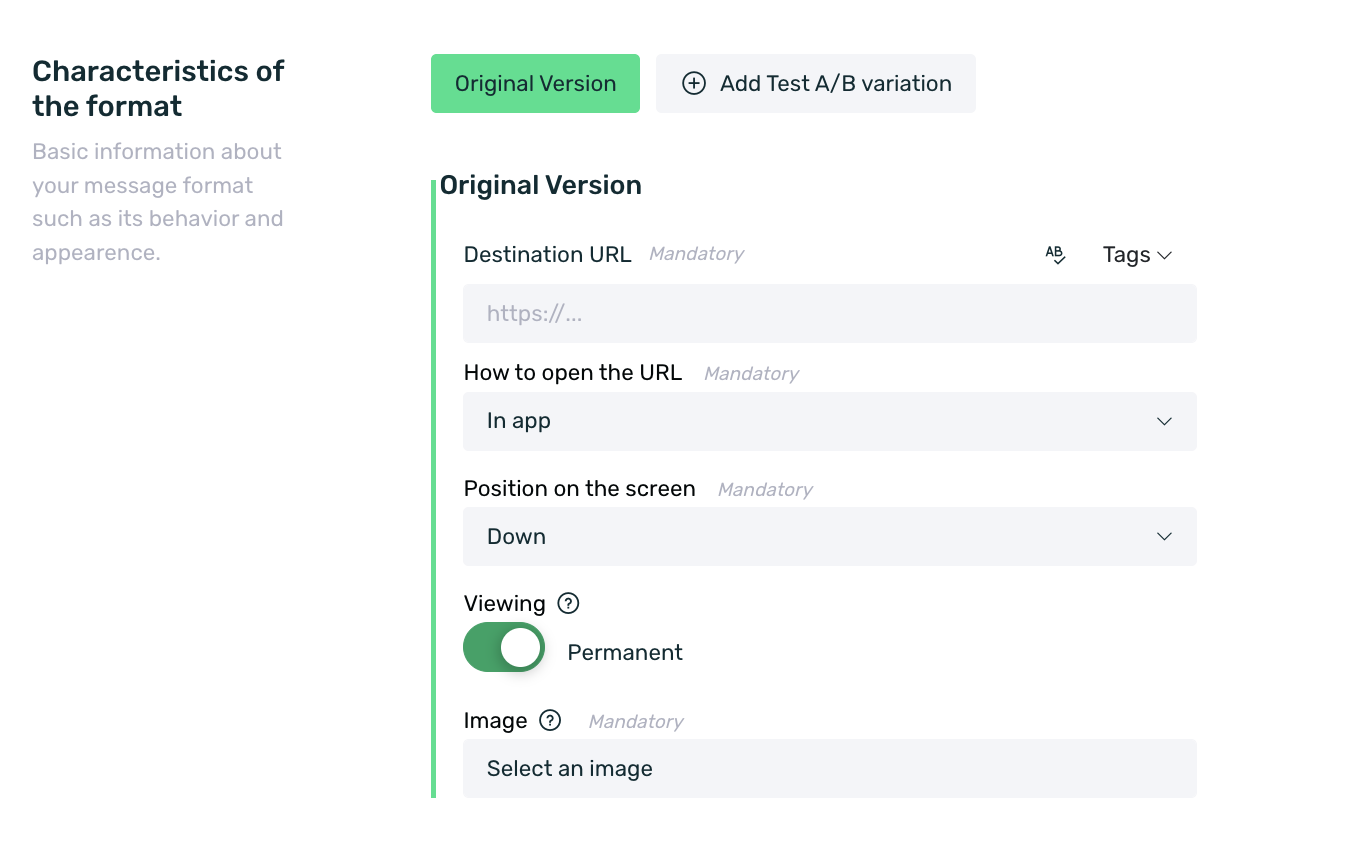
- Destination URL: In applicable formats Startview, Adball, Banner, Prisma, and Dynamic Tab), enter the URL where you want to redirect users when they click on the communication. It can be a website or a specific section of your App (via deeplink).
IMPORTANT: All redirection URLs, whether set directly in EMMA or not, must comply with the HTTPS protocol to avoid redirection errors when opening EMMA's embedded webviews.
The Adball, Banner, and Startview formats allow the use of a replacement engine to append tags to the URL set in EMMA so that the URL content can be customized based on these tags.
To enable customization, the destination landing page must be able to retrieve the parameter and the tag value to apply it for personalization.
-
Image: In formats that require it (Adball, Banner, Coupon, Prisma, and Dynamic Tab), enter the image you want to display in the communication.
-
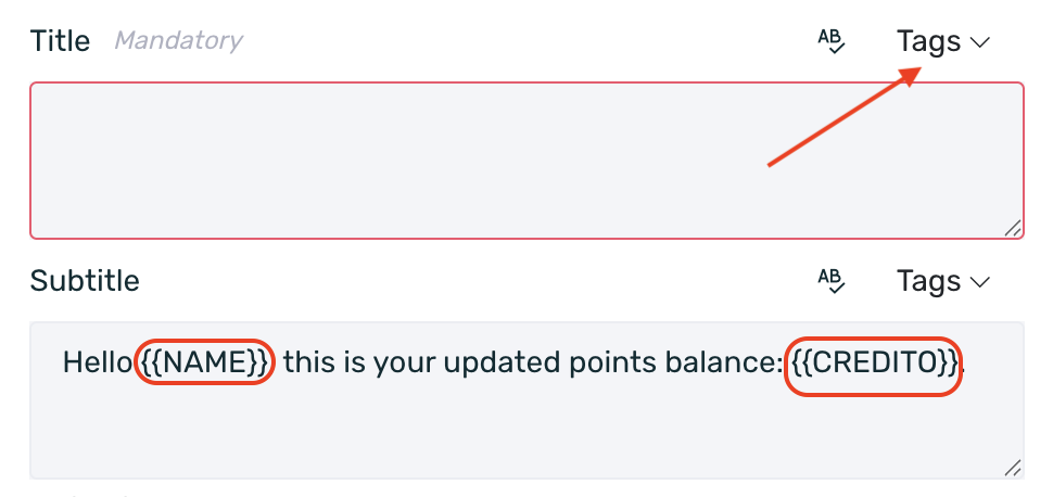
Message: In formats that require it (Coupon and Strip), enter the text you want to display in the communication. Use our text replacement engine to insert the individual value of the tags assigned to your users.
To do this, in the Message field, insert the tags you want to use by selecting the ‘Tags’ option. The list of tags displayed will depend on the properties/tags that your App is sending to EMMA. You can check how to send tags through our Android and iOS SDK.
Those users who receive a communication with a text composed of variables from the replacement engine but do not have any assigned property for that tag will only see the text without the variables.
Fill in the specific fields for each communication format. Visit the different types of communication to learn about the specific properties of each one.
Select Next to continue with scheduling, Back to return to the previous step, or Cancel to discard unsaved changes in the campaign.
¶ Scheduling
In the Scheduling section, you will configure the display settings for the communication.
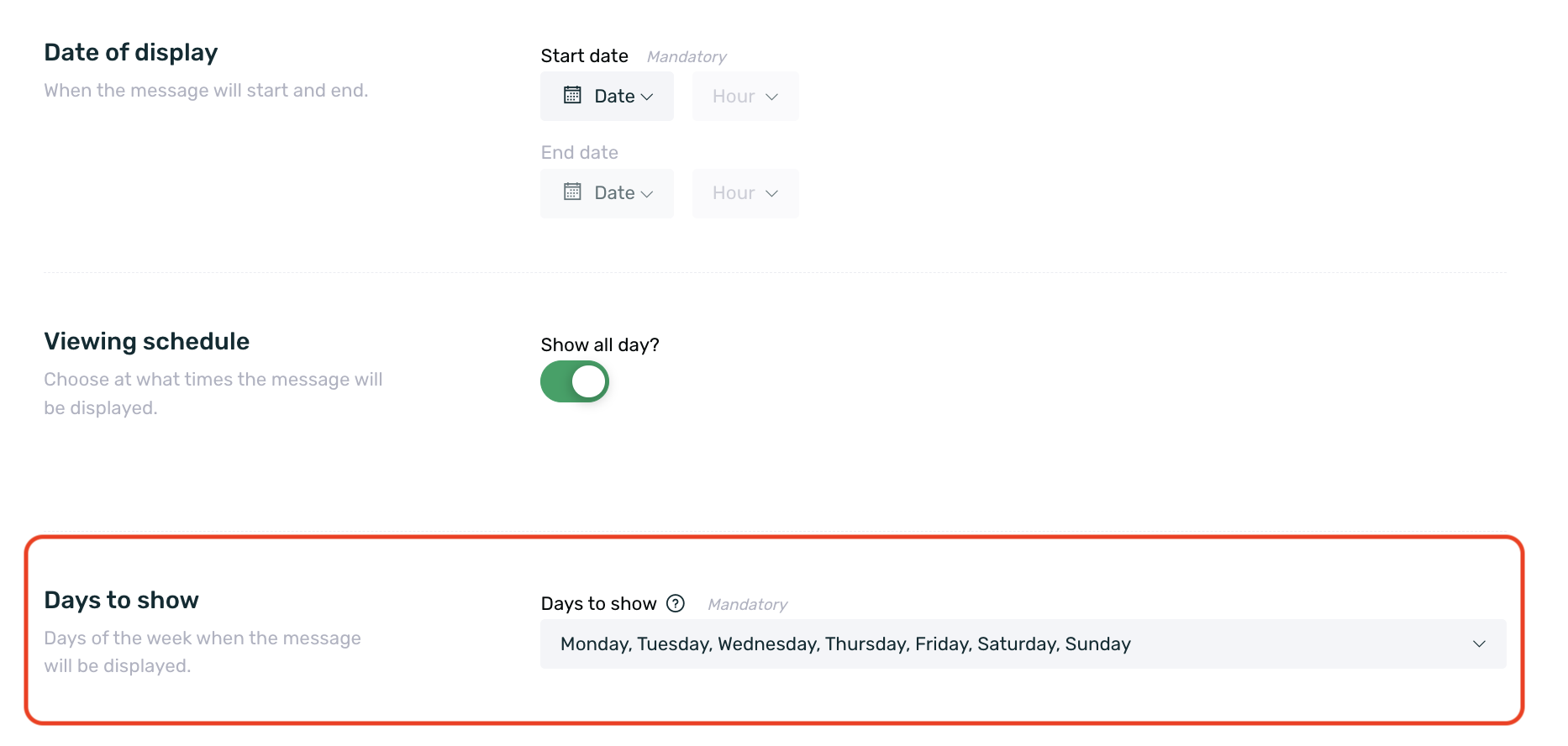
¶ Date of display
If you have selected Manual (Classic) as the campaign type, you must specify the date of display for the message on this screen. Indicate the exact day and time when you want it to be shown.
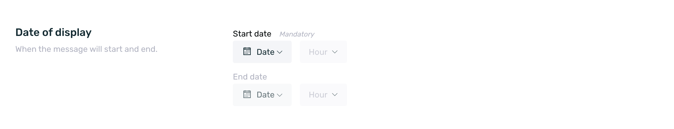
- Start Date: Select the date and time when the communication should begin. For example, July 27 at 10:35. The start date cannot be earlier than the creation date.
- End Date: Select the date and time when the communication should end. For example, August 27 at 23:55. The end date cannot be earlier than the start date.
¶ Viewing schedule
In the viewing schedule section, you can specify whether the communication should be shown throughout the entire day (by keeping the checkbox enabled) or only during a specific time frame. If you choose a specific time frame, you must disable the checkbox and set the desired time range by adjusting the green slider.
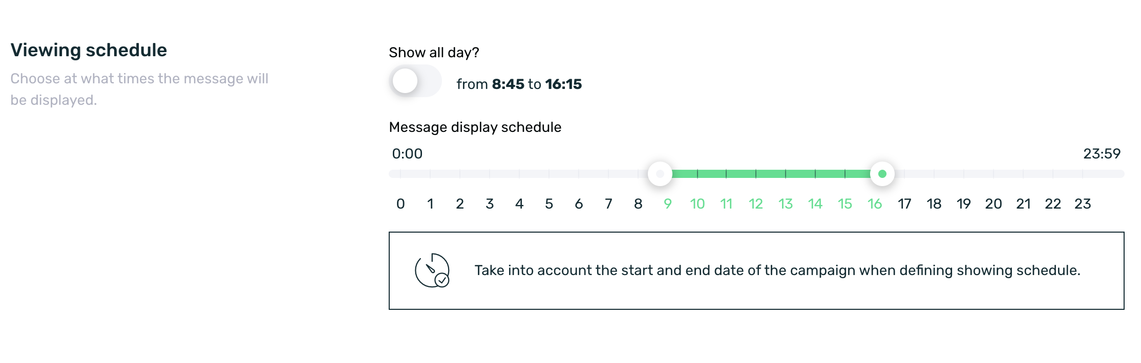
Keep in mind that the campaign’s start and end dates may be affected by the display time settings. Different scenarios can occur depending on whether the selected date matches the display time frame:
-If the campaign starts after the display time has already passed, the communication will not be shown until the next day during the corresponding time frame.
-If the campaign’s end date is set before the display time starts, the communication will not be displayed on that day.
-If the campaign’s start or end date partially overlaps with the display time frame, the communication will be shown only during the overlapping period.
¶ Frequency
Frequency allows us to set the total number of times the campaign will be shown to each user during its active period.
By default, the frequency is unlimited (always).
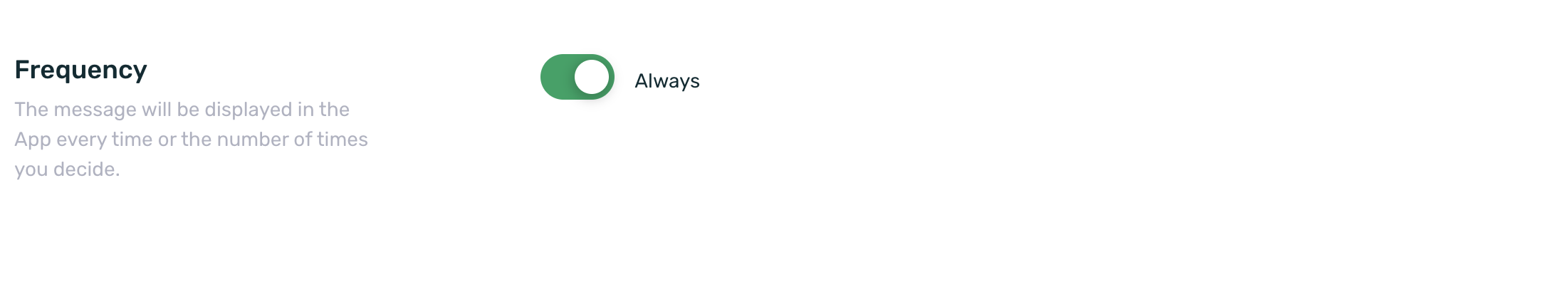
But if needed, a specific frequency number can be set. To do this, simply disable the switch and set the desired value.
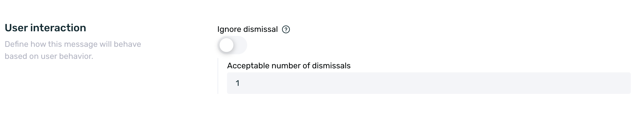
¶ User interaction
In the User Interaction section, we can determine the behavior of the message based on the rejection actions performed (or not) by the user.
It is important to remember that the rejection click control is permanent. Once the user fulfills the condition, they will never see that message again.
By default, the checkbox is activated, meaning no rejection control will be applied (clicking on the close cross).
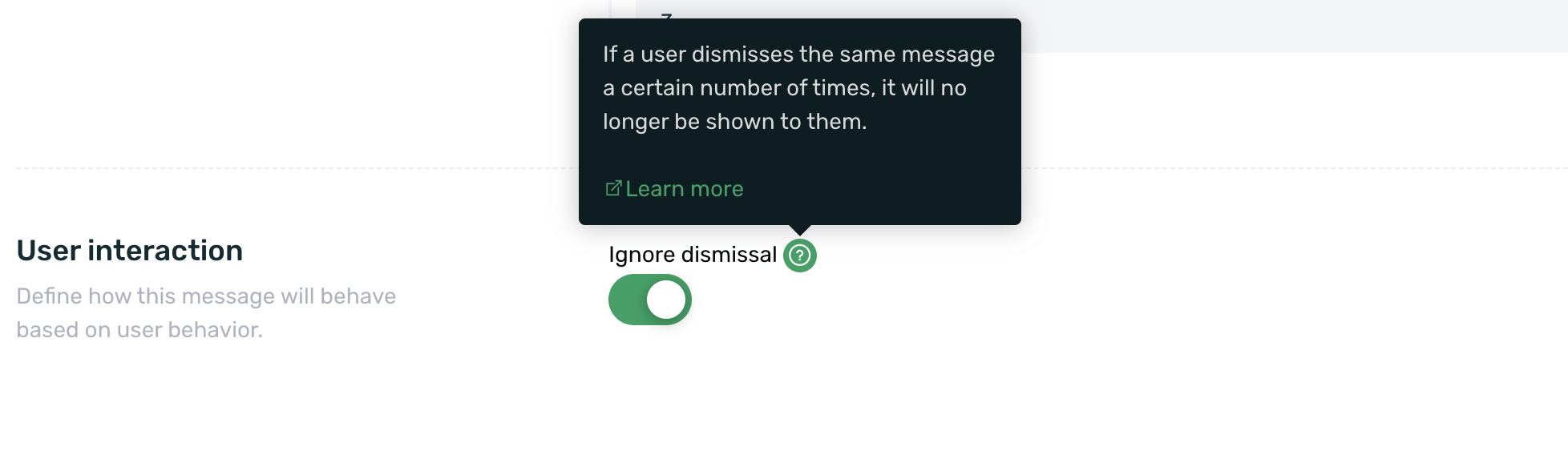
If the checkbox is deactivated, you can set the number of rejections (clicks on the close cross) after which the message will no longer be shown to the user.
This functionality is only available for formats that include a close cross, such as Adball, Startview, Prisma, and Native Ad if a close cross has been integrated.
It is important to note that this limit works in conjunction with the impact configuration that has been set.
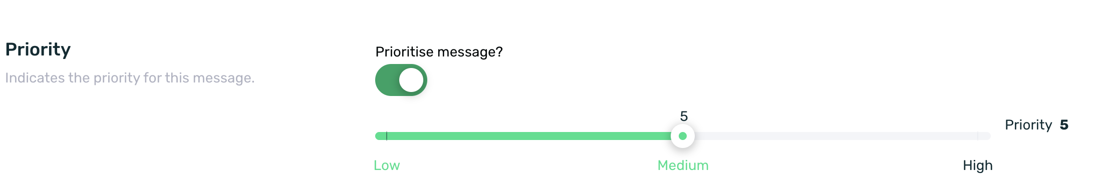
¶ Priority
By default, EMMA communications are displayed in descending order of creation, meaning the most recently created communication appears first, and the least recent appears last.
However, with the priority field, we can set the order in which communications will be displayed, with 9 being the highest priority (displayed first) and 1 being the lowest priority (displayed last).
By default, priority is disabled, so the communication display behavior follows the most recent to the least recent order.
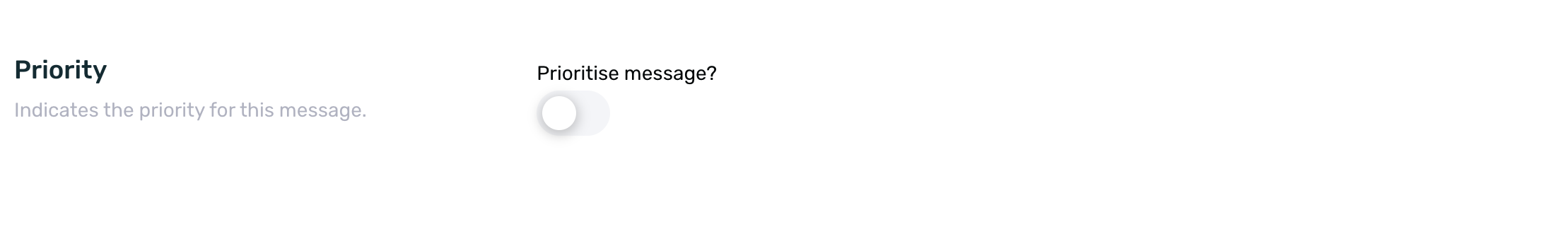
If we want to set a priority, we simply need to enable the switch and assign the desired priority level to each communication.
It is important to note that priorities apply within the same format and not across different formats. For example, if there is an Adball with priority 9, another Adball with priority 5, and a Startview with priority 8, the display order will not be Adball, Startview, Adball, since priorities do not work across formats.
Additionally, priority can be configured directly from the message table in the editable Priority field without needing to edit the communication.
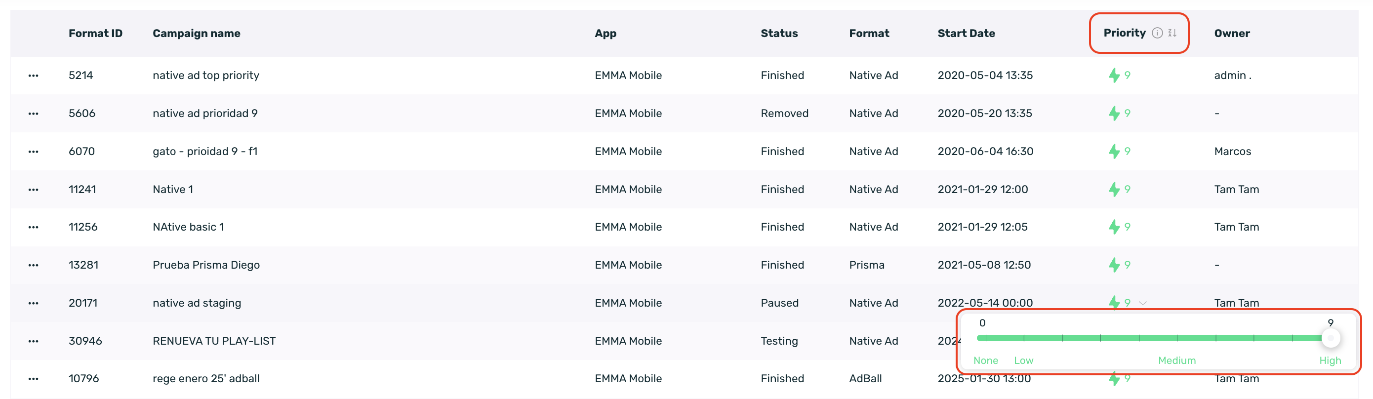
From the Priority column, we can perform the following actions:
- Sort the table in ascending or descending order.
- Modify, add, or remove the priority.
To modify the priority, simply click on the corresponding cell, and the selector will appear.
We can differentiate communications with priority from those without priority because the former will display the configured priority, while the latter (without priority) will be represented with a "-".
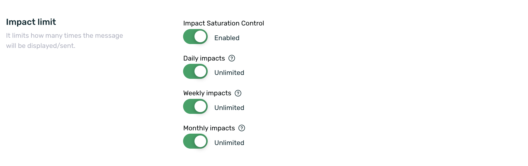
¶ Impact limit
Finally, we can set the impact limit, meaning the number of times the campaign will be shown to the user, within three time periods:
- Daily view limit.
- View limit for the last 7 days.
- View limit for the last 30 days.
If you set a limit, once the campaign is launched, the user will not be able to see it more times than defined. This value can be modified later, even if the campaign is active. For example, if the weekly limit is edited from 2 to 5, and the user has already seen the campaign twice that week, they will be able to see it 3 more times until reaching the newly established limit.
With the saturation control check, you can configure whether the campaign will follow the saturation control rules or ignore them. You can find more information about Saturation Control here.
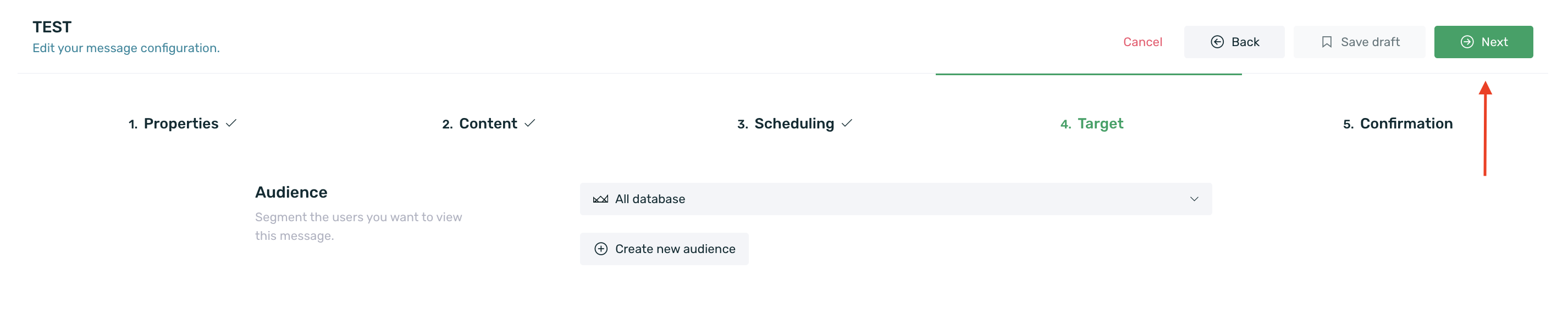
¶ Target
Once we reach the Target step, we must define the target audience we want to impact with the communication. To do this, we need to select an available audience from the list or create a new one by clicking the + Create new audience button.
If the audience list is empty, it means that there are no available audiences to use or that you have not created any yet. You can find more information on how to create audiences in this guide.
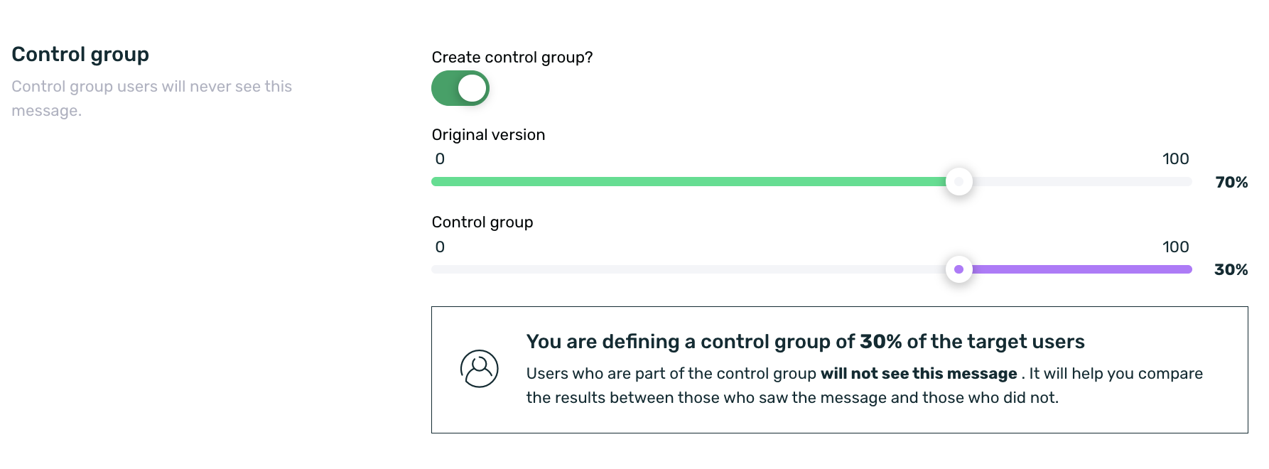
If you want to set a control group for your communication, you must enable the control group checkbox and set the % of users who will view the original communication and the % of users who will not view the communication. For more information about the control group, visit our guide on Control Group.
Once you have selected the desired audience and set (or not) the control group, click on the Next button to continue with the campaign setup.
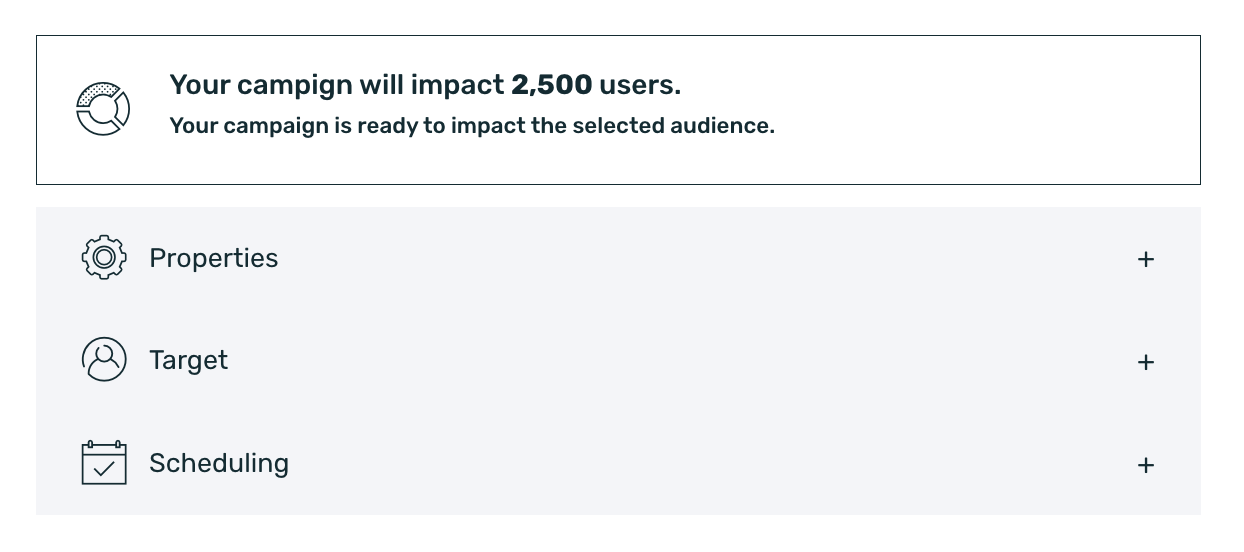
¶ Confirmation
Before launching the campaign for your audience, review the message setup on the final summary screen. Here, you can review all the settings made in the previous steps.
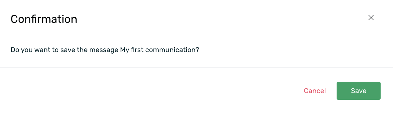
Select Send message to publish your message, Back to return to the previous step, Cancel to delete any unsaved changes in the campaign, or Save as draft to save your campaign as a draft without publishing it.
If you have the role system active for campaign pre-validation, you can also send the campaign to Test message, Send to validate, or Approve message depending on the user's role. Click here to learn more about the campaign pre-validation system.
As a final security measure, EMMA will display a new confirmation message before launching the campaign.
¶ Campaign statuses
Once you have created your campaigns, they may be in one status or another, depending on the characteristics they meet. The possible statuses a communication can have are:
-
Active: Your campaign has started, is active, and is being shown to the corresponding users.
-
Approved: This status only applies if the campaign pre-validation system is in use. More information on this here. It means the campaign has been approved and is waiting to be officially launched. While the campaign is in this status, it is not visible to any users.
-
Removed: The campaign has been deleted.
-
Draft: The campaign has been saved as a draft. In this status, it is not shown to any users and can be retrieved at any time to be launched.
-
Finished: The campaign has finished because the established end date has passed. In this status, no user can view it.
-
Paused: The campaign is paused and is not being shown to any users.
-
Ready: This status only applies to automated campaigns and means the campaign is ready to be used in a rule or customer journey. In this status, the communication is not being shown to any users.
-
Scheduled: The communication is waiting to reach the established start date to be activated and start showing to users.
-
Testing: This status only applies if the campaign pre-validation system is in use. More information on this here. It means the campaign is in testing mode and is being shown to users who meet the established segment.
-
To validate: This status only applies if the campaign pre-validation system is in use. More information on this here. It means the campaign has been created and is waiting to be validated and approved to be launched. While the campaign is in this status, it is not visible to any users.
¶ InApp message types
In EMMA, there are different types of InApp messages:
-
Adball: The Adball is a communicative format in the shape of a bubble that will appear on the user's screen when they open the app. For more information on how to configure an Adball, click here.
-
Banner: The Banner is the basic format for your communications that can be used to communicate specific messages on a screen. For more information on how to configure a Banner, click here.
-
Coupon: The Coupon is a format that gives you the option to redeem coupons if you have a physical location, controlling the number of redemptions, promotional code, and activation and expiration dates. For more information on how to configure a Coupon, click here.
-
Dynamic Tab: The Dynamic Tab is a communicative format that is included as a new tab within your TabBar, so if your app doesn't have a TabBar, you won't be able to activate this format. For more information on how to configure a Banner, click here.
-
Native Ad: The Native Ad is a format that includes your communications while always respecting the platform’s format and style. It shifts the typical spaces reserved for ads and integrates into the content, becoming part of the user experience when they visit the medium. For more information on how to configure a Coupon, click here.
-
Prisma: PRISMA is a very innovative format, very similar to a StartView, but with a substantial difference. It behaves like a Slider and has a 3D style. For more information on how to configure a Coupon, click here.
-
Startview: The Startview is an interstitial that expands to cover the entire screen and is shown when the app is opened or when the user takes an action such as opening a specific tab or clicking a button. For more information on how to configure a Coupon, click here.
-
Strip: Strip is a communicative format that occupies the notification bar of the device (where the time, battery, etc. usually appear). For more information on how to configure a Coupon, click here.
¶ Consult, edit, or delete Campaigns
Scheduled messages can be consulted, edited, cloned, or deleted. Below are the steps to follow to perform these actions:
Once logged into EMMA, go to Communication > Messages. Here, you will see a table with all the scheduled and saved campaigns:
¶ Consult campaigns
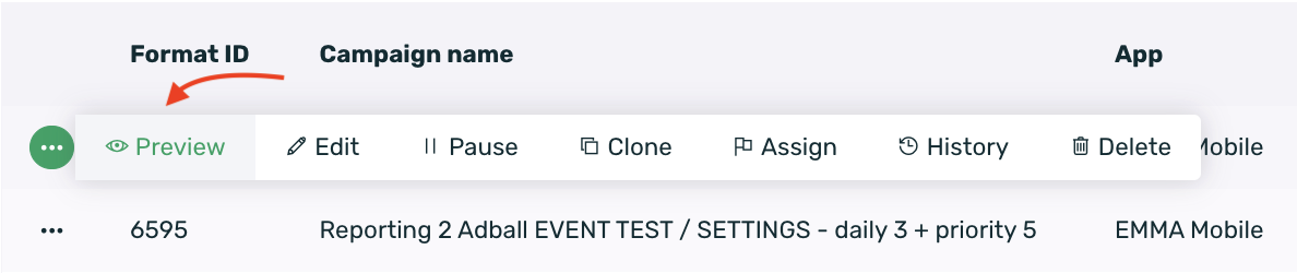
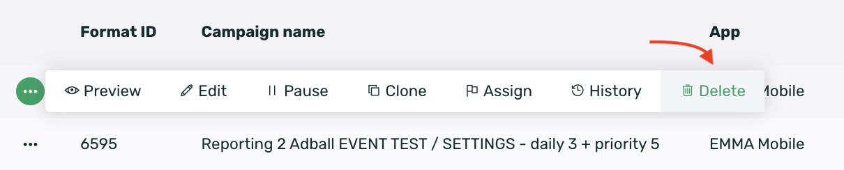
Search for the campaign you want to consult in the table and click on the contextual menu that appears to the left of the Campaign Name column, then select the Preview option.
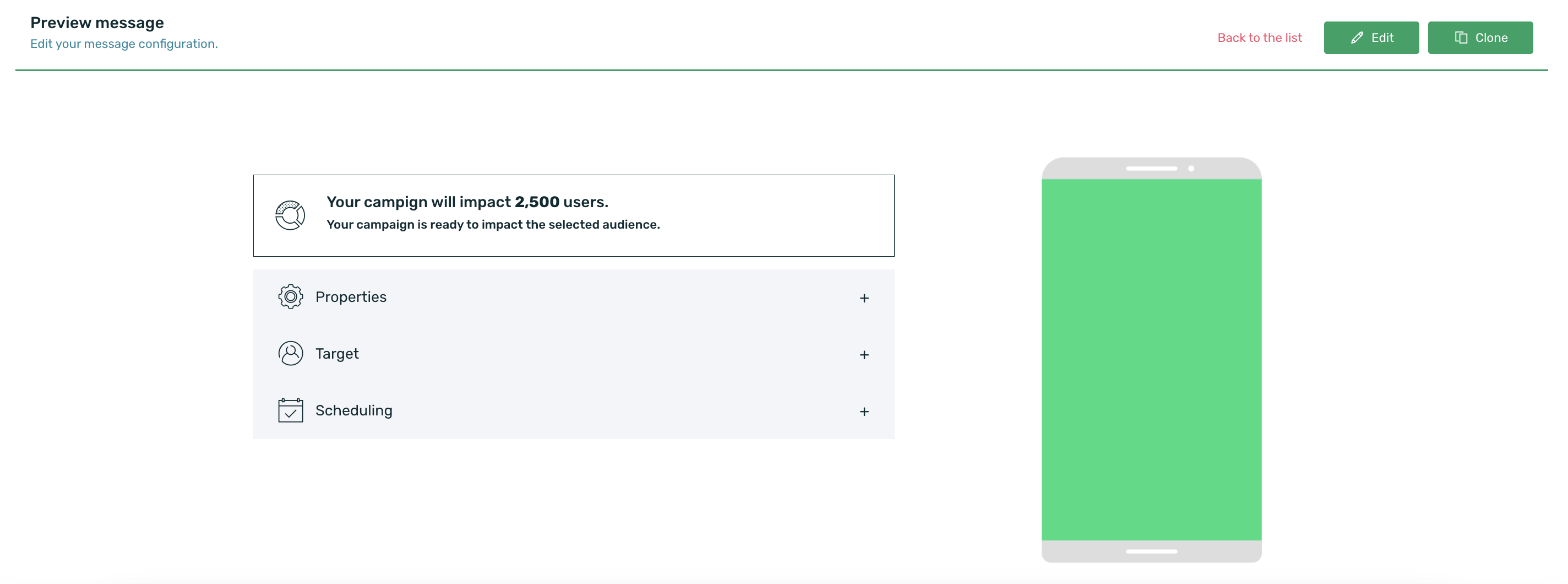
The final campaign summary screen will then be displayed. From this screen, you can edit or clone the campaign. Close this screen by clicking Back to the list.
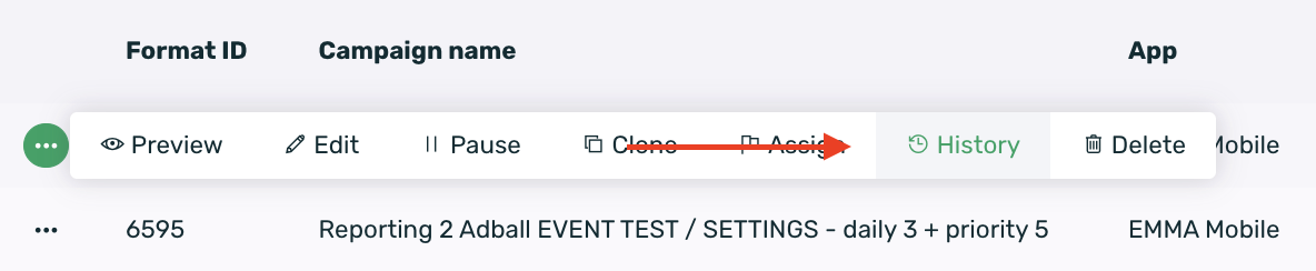
Check the history of the modifications to your campaign by clicking on the contextual menu to the left of the campaign name and selecting the History option.
¶ Edit campaign
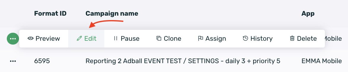
To edit your campaign, click on the contextual menu to the left of the campaign name and then select the Edit button.
Click on the contextual menu and select Clone to clone one of your already scheduled campaigns.
Click on the contextual menu and select Pause/Launch to pause or activate your campaigns.
¶ Delete campaign
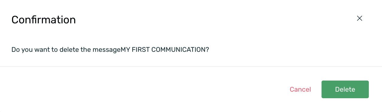
Delete the campaign by selecting the trash can icon in the contextual menu. Please note that this action cannot be undone.
When this option is selected, a confirmation message will appear to delete the campaign. Select Delete if you want to proceed with the deletion or Cancel if you are unsure about deleting it.
¶ Adball
The Adball is a communication format shaped like a bubble that will appear on the user's screen when the app is opened.
When the user clicks on the communication, the URL you entered in the destination URL will be displayed (this URL must be HTTPS). We recommend that the web content is structured so that it adapts to all types of mobile devices.
To close it, simply drag it to the bottom of the screen.
When multiple AdBalls are activated targeting matching users who may be in different segments, it's important to keep in mind that if they overlap in the scheduled period, they will follow the same behavior pattern: the last scheduled AdBall will always take precedence.
You should consider the following situations in the case of simultaneous scheduling:
-
If you've selected a frequency capping, the frequency capping of the last created AdBall will always take precedence. This means that even if the first scheduled AdBall impacts the same segment, it won't be shown while the second AdBall is active.
-
If you don't set any frequency capping (Always) on the last created AdBall, and the previous AdBalls have the same or a different capping, in both cases, only the last AdBall will continue to be shown because its frequency capping takes precedence.
Make the specific configuration of the Adball format:
- Destination URL: URL that will be displayed/shown when clicking on the Adball. This URL can have attached tags for personalization and even parameters with fixed values. For example: https://www.milanding.es?nombre={name}&favorito={local_favorito}&código=123
The Adball, Banner, and Startview formats allow the use of a substitution engine to append tags to the URL set in EMMA, enabling the URL content to be personalized based on these tags.
To carry out the personalization, the parameter and value of the tag must be retrievable from the destination landing page in order to use them for personalization.
-
Vertical position: Select the vertical position where the Adball will appear:
- Top
- Middle
- Bottom
-
Horizontal position: Select the horizontal position where the Adball will appear:
- Left
- Right
-
Click tracking: Select the click measurement model for the Adball from the following options:
- Tap: A click will be measured when the Adball is opened. This occurs when the Adball itself is explicitly clicked.
- URL Change: Each URL change within the webview will be counted as a click. If a user navigates through the webview and there are 4 URL changes, 4 clicks will be recorded.
- Deeplink: A click will be measured each time a deeplink is triggered from the Adball, whether directly (the deeplink is triggered upon clicking the Adball) or indirectly (there's a button in the configured landing page that contains the deeplink).
- URL Click: A click will be measured when the user reaches a specific URL configured in the communication. If this option is selected, the URL to be tracked as a click must be specified in the URL Click field.
-
Image: Upload the image you want to display when the Adball is shown. This guide provides more information on the image specifications for an Adball.
-
A/B Test Variations: If applicable, add the necessary A/B test variations. You can find more information about A/B testing here.
Being able to select the position of the Adball will only be available starting from version 4.1 of the EMMA SDK for iOS and Android.
From the app preferences, we can define the default click measurement type for the Adball. Regardless of the type defined in this section, we can always modify it when creating the communication to best suit the situation at that moment.
¶ Banner
The Banner is the basic format for your communications that you can use to communicate specific messages on a screen.
You can choose the number of impressions, how long it will stay on the screen, and the position (top or bottom). Additionally, you can set it so that when the user clicks on it, they are redirected to an external URL or to another section within the app (via deeplink).
The Banner configuration is as follows:
- Destination URL: The URL to which you want to redirect users when they click on the Banner. It can be a website (in this case, the URL must use the HTTPS protocol) or a specific section of the app (via deeplink).
If you configure a URL, it can include tags for customization and even parameters with fixed values. For example: https://www.milanding.es?nombre={name}&favorito={local_favorito}&código=123
The Adball, Banner, and Startview formats allow the use of a substitution engine to attach tags to the URL set in EMMA, so that the content of the URL can be personalized based on those tags.
To perform the customization, the destination landing page must be able to retrieve the parameter and the tag value in order to use them for personalization.
-
How to open the URL: Select the environment in which you want the Banner redirection to be displayed:
-
In-app: When clicking on the Banner, a full-screen webview will open displaying the content of the configured URL.
-
Default browser: When clicking on the Banner, the configured URL will load in the default browser that the user has set on their mobile device.
-
-
Position on the screen: Select the screen position where you want the Banner to appear. You can choose between:
- Bottom
- Top
-
Frequency: Set the frequency of your Banner. You can find more information about frequency here.
-
Viewing: Set the display time (in seconds) during which the Banner will be shown. By default, it is always shown. Disable the selector to set a specific viewing duration.
-
Image: Select the creative (jpg, png, gif) that you want to display in the Banner. You can view the creative specifications here. If the image is too large, it will crop the creativity centrally.
-
A/B Test Variations: If applicable, add any necessary A/B test variations. You can find more information about A/B Testing here.
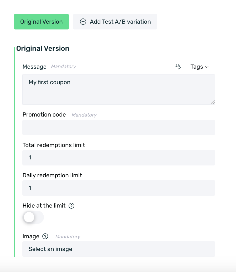
¶ Coupon
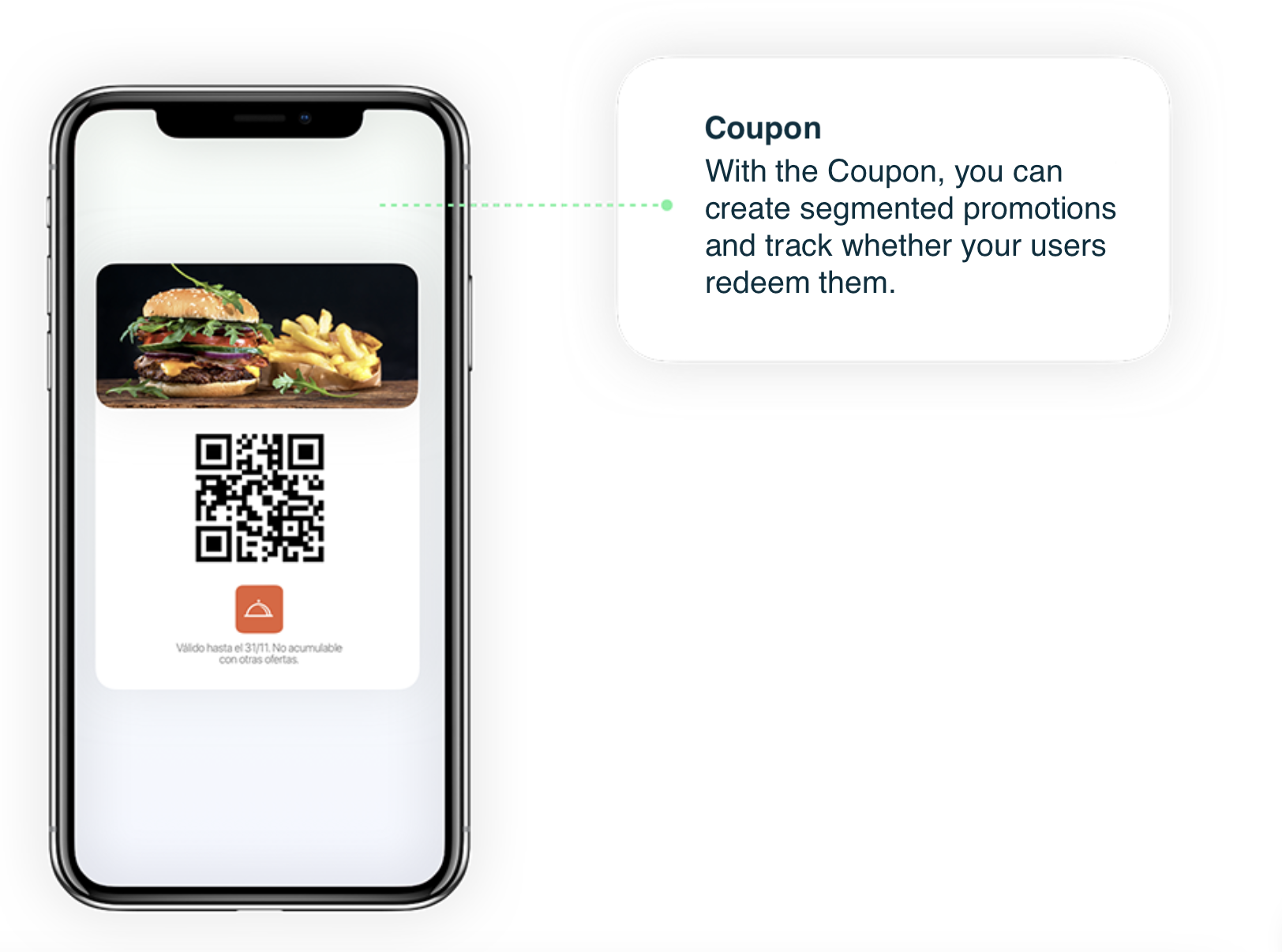
The Coupon is a format that allows you to redeem coupons if you have a physical location, controlling the number of redemptions, the promotional code, and the activation and expiration dates. With the Coupon, you can create segmented promotions and track whether your users redeem them.
Simply by entering the message you want to appear on the Coupon along with the selected promotional code, EMMA will generate a QR code for your users to redeem the promotion at the physical location.
It is important to select the maximum number of redemptions a device can make for the Coupon in the Total Redemptions Limit option and the number of redemptions a device can make per day in the Daily Redemptions Limit field. Additionally, with the Hide at the limit option, you can decide whether the coupon should stop being displayed to devices that have reached the redemption limit.
For automated campaigns, you can also set the Coupon to be available for 90 days. This allows you to establish an expiration date for the Coupon. For example, if a user receives a Coupon for their birthday, they will only have three months to redeem it. After that period, the Coupon will no longer be visible to the user and cannot be redeemed.
The specific configuration for the Coupon is as follows:
- Message: The message displayed to the user when they see the Coupon, for example, specific conditions of that Coupon.
- Promotion Code: Internal promotional code to identify the Coupon.
- Total redemptions limit: Sets the maximum number of times a user can redeem the +Coupon.
- Daily redemptions limit: Sets the maximum number of redemptions per day a user can make for the Coupon.
- Hide at the limit: If enabled, the Coupon will be hidden once the user reaches the maximum number of redemptions.
- Hide After 90 Days: This option is only available for automated campaign rules. You can decide whether the Coupon will be hidden 90 days after its creation.
- Image: Upload the image that the user will see when the Coupon is displayed.
- A/B Test Variations: If applicable, add the necessary A/B test variations. You can find more information about A/B testing here.
You can also set specific display days for a Coupon. This means the Coupon will be visible on certain days and hidden on others based on your selection. This configuration is done in Step 3: Scheduling.
The days selected in the input field will be the days when the Coupon is visible, while the unselected days will be disabled, meaning the Coupon will not be shown on those days. If you want the Coupon to be displayed Monday through Sunday, simply select all days.
Coupons are displayed to users based on the client ID field. This means that if a user within the coupon segment has a client ID matching another user who is not in the segment, the coupon will still be displayed to both users.
¶ Use Case
Coupons are primarily designed for restaurant apps, as this is where they are most commonly used.
Example: Restaurant App Structure
Imagine a restaurant app with the following sections:
- Home screen: Where users land upon opening the app.
- Menu section: Displays all available food and drink items.
- Restaurants section: Allows users to locate restaurants nationwide.
- Promotions and offers section.
It would be in this last section of promotions or offers where we could see the coupons themselves. Once the user accesses this section, they will be able to see the different offers provided in the app, these would be the coupons themselves.
What the coupon does is show the active offer(s) at the moment in a list, and when accessing the details of each offer, we can see the promotional image of the coupon (the same one as in the general promotions list) with a description of the offer itself and a QR code for the user to redeem the promotion at the physical location.
In this way, EMMA will be able to track the number of redemptions a specific coupon has had, as well as the devices that carried out those redemptions.
¶ Dynamic Tab
The Dynamic Tab is a communication format that is added as a new tab within your TabBar, so if your app doesn't have a TabBar, you won't be able to activate this format.
This format is only available for the iOS operating system. Due to limitations of the Android operating system, it is not possible to use it on this OS.
As with the other formats, we recommend that the web content you enter in the Destination URL field be structured to ensure it adapts to all types of mobile devices and complies with the HTTPS protocol to avoid loading errors when displaying the content of the URL.
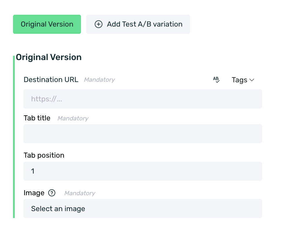
The fields to configure when creating a Dynamic Tab are:
-
Destination URL: The content that you want to display to the user when they click on the Dynamic Tab. It can be an external URL or a deeplink that takes the user to a specific section within the app.
-
Tab Title: The name that will be displayed on the new tab in the menu.
-
Tab Position: The position that the Dynamic Tab will occupy within your TabBar menu.
-
Image: Set the image that will be displayed on the new tab that appears in the menu. You can view the creativity specifications here.
-
A/B Test Variations: If applicable, add the necessary A/B Test variations. You can find more information about A/B Testing here.
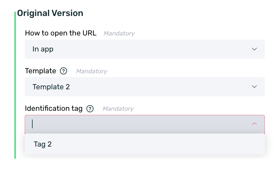
¶ Native Ad
¶ Type
The Native Ad is a format that includes your communications while always respecting the format and style of the app's content. The typical spaces reserved for advertisements are moved and integrated into the content, becoming part of the user experience when visiting the medium.
To view this type of campaigns, you will need to define in your application code how these native ads will appear. In this guide, you can see the necessary integration for Android, and in this other one, the integration for iOS.
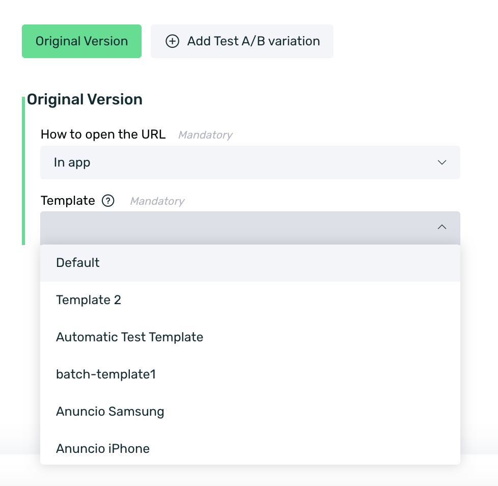
Then, you can choose from the available templates, and depending on the chosen one, you will need to add the texts, images, and links you want to display.
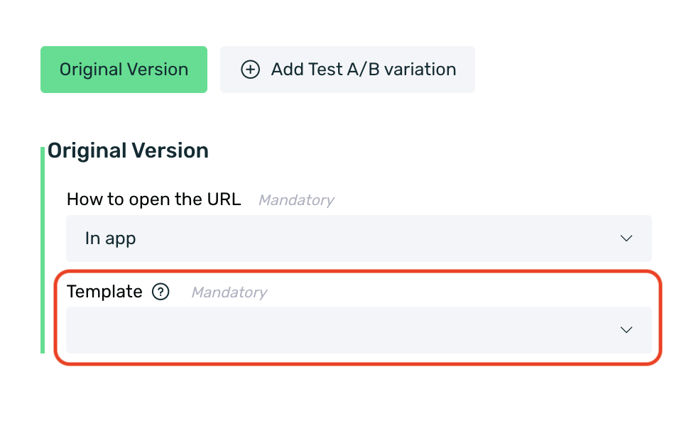
Once the template is selected, if tags were assigned during creation, this is the moment to choose the desired tag for this template. You can choose one tag or none, but multiple tags cannot be selected at the same time.
Remember that the templates are defined from the Native Template screen, and the SDK provides the fields for the app developer to customize the *Native Ad+ layout for your app.
When creating a Native Ad, in step 3. Scheduling, there is a field called Priority. This field is used to set a display priority for the Native Ad in question, but it only applies to multiple Native Ads that are implemented in a special way (the team that integrated the EMMA SDK should confirm if your app uses batch Native Ads or not).
When priority is activated, instead of returning all available native ads with that template, only the one with the highest priority will be returned, and so on.
If batch Native Ads are NOT used, this field should not be enabled as it will cause the communication not to be displayed on the device.
¶ Create templates
As we mentioned earlier, Native Ad is the communication format you can configure with EMMA, allowing you to incorporate and adapt your communications to the app's own content.
Now let's see how to create your first Native Ad template, which you can later configure as shown below.
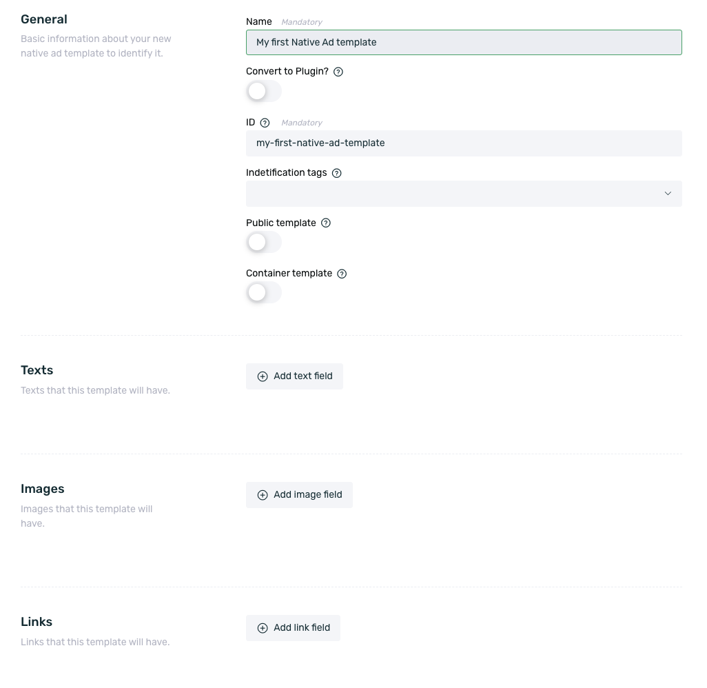
- Log in to EMMA and go to Management > Native Templates.
- Click on the + New Template button.
- In the form that has appeared, you need to specify the fields for this template. You can add all the text, image, or link fields you need for your native format. Additionally, at this point, you can also add identifying tags. These tags will be useful, for example, to identify Native Ads that use the same template more than once. In other words, when creating a Native Ad that uses this template, you can choose one of the tags so that the app can distinguish this specific ad from others that use the same template.
-
Name: Name field for this template.
-
Convert to Plugin?: If you convert the template to a Plugin, it will become an additional communication format available in EMMA under the Communication > Messages section. This field is irreversible, and once the template is saved, it cannot be modified.
-
ID: This is the identifier for the template. It must be a unique value so that the app can recognize the type of template and how it should be displayed within the app. By default, EMMA converts the configured name into the ID, but it can be changed to any preferred value.
-
Identification Tags: Write the name you want for the tag. You can add multiple tags. These tags will be used to identify Native Ads that use the same template more than once. In other words, when creating a Native Ad that uses this template, you can select one of the tags so that the app can identify this specific ad from others that use the same template.
-
Public Template: Enabling this option will allow you to set your template as public or private. If the template is public, it can be used in all the apps associated with your EMMA account. If the template is private, it can only be used in the app in which it was created.
-
Container Template: If you enable the template as a container, the communication content will be a list of items, where each item consists of the text, image, and link fields configured in the template.
-
Text Field: Add the necessary text fields. You can specify what type of text field it is (Title, Subtitle, Body, or Custom, where you can choose your preferred category). Additionally, in any text field, you can add predefined values that will be available for selection when creating the communication.
-
Image Field: Add the necessary image fields. You can specify what type of image field it is (Main Image, Secondary Image, or Custom, where you can choose your preferred category).
-
Link Field: Add the necessary link fields. You can specify what type of link field it is (CTA or Custom, where you can choose your preferred category).
By enabling or disabling the Required button, you can set whether the fields must be mandatory or not when using the template.
Each field is individual, so you can decide which ones are mandatory and which are not, depending on your needs. This way, you can use the same template for all communications without needing to change the templateID in the app.
- Finally, click Save Template.
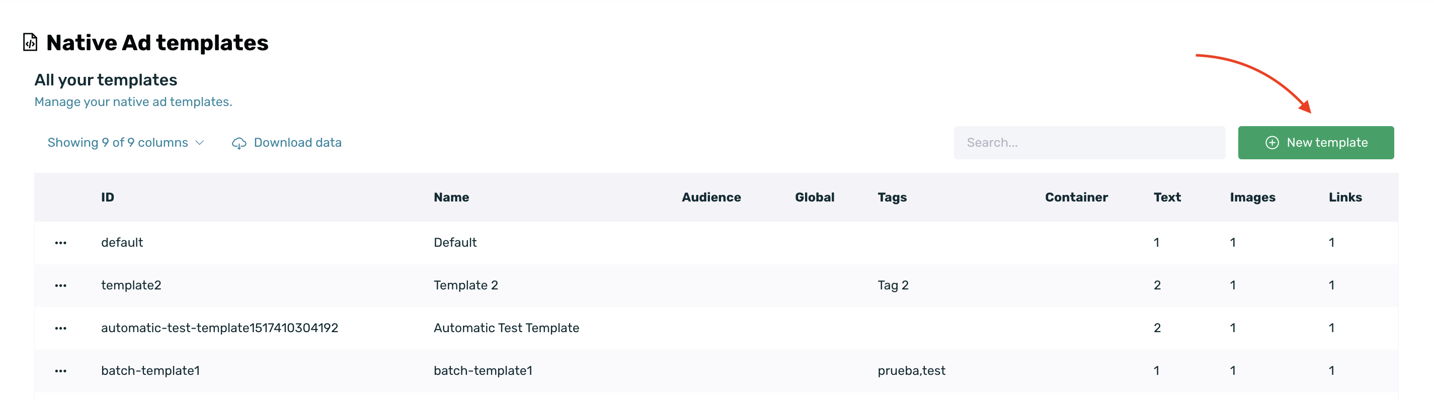
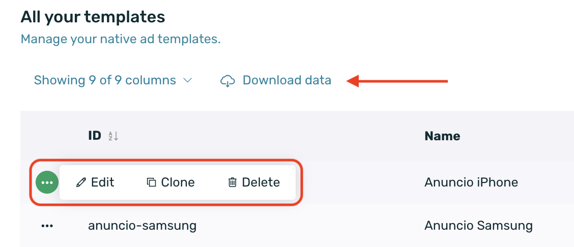
¶ Manage Templates
Once you've created your first Native Ad template, you can edit, clone, delete, or export the templates.
- Edit allows you to modify any property of the template except for the Plugin selector. Remember, if you edit the Identifier, the Native Ad may stop functioning in your app.
- Clone allows you to create a new template based on an already saved one.
- You can also delete the template at any time.
You can export this same table by clicking the Download Data button.
To perform any action on a template, hover over the contextual menu that appears to the left of the table. A menu will drop down, from which you can choose to edit, clone, or delete the specific template.
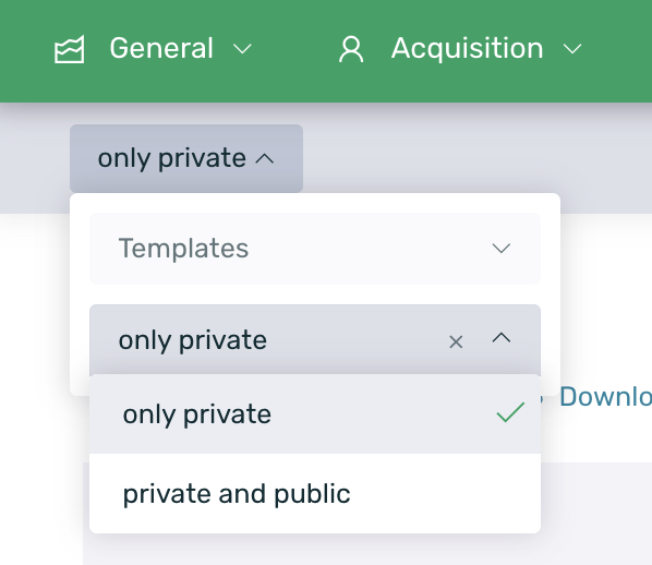
On the Native Templates screen, by default, only private templates will be displayed. However, through a filter, we can select which templates we want to view. By selecting the Only private templates option, we will only see private templates, meaning those exclusive to the app. By selecting Private and public templates, we can view all templates, regardless of whether they are exclusive to the app or public for all apps in the account.
In the summary table of the templates, we can see the following information:
- ID: The template's ID.
- Name: The name given to the template.
- Public: In this column, we can see if the template is public or not.
- Tags: A list of tags assigned to the template.
- Container: In this column, we can see if the template is a container or not.
- Text: The number of text fields in the template.
- Images: The number of image fields set for the template.
- Links: The number of links contained in the template.
Keep in mind that by using the Search bar, you can easily locate your templates.
¶ Using Native Ad templates
Once you create a template, it will be available for selection on the Messages screen when creating a Native Ad.
To see how to create your first Native Ad, click here.
¶ Prisma
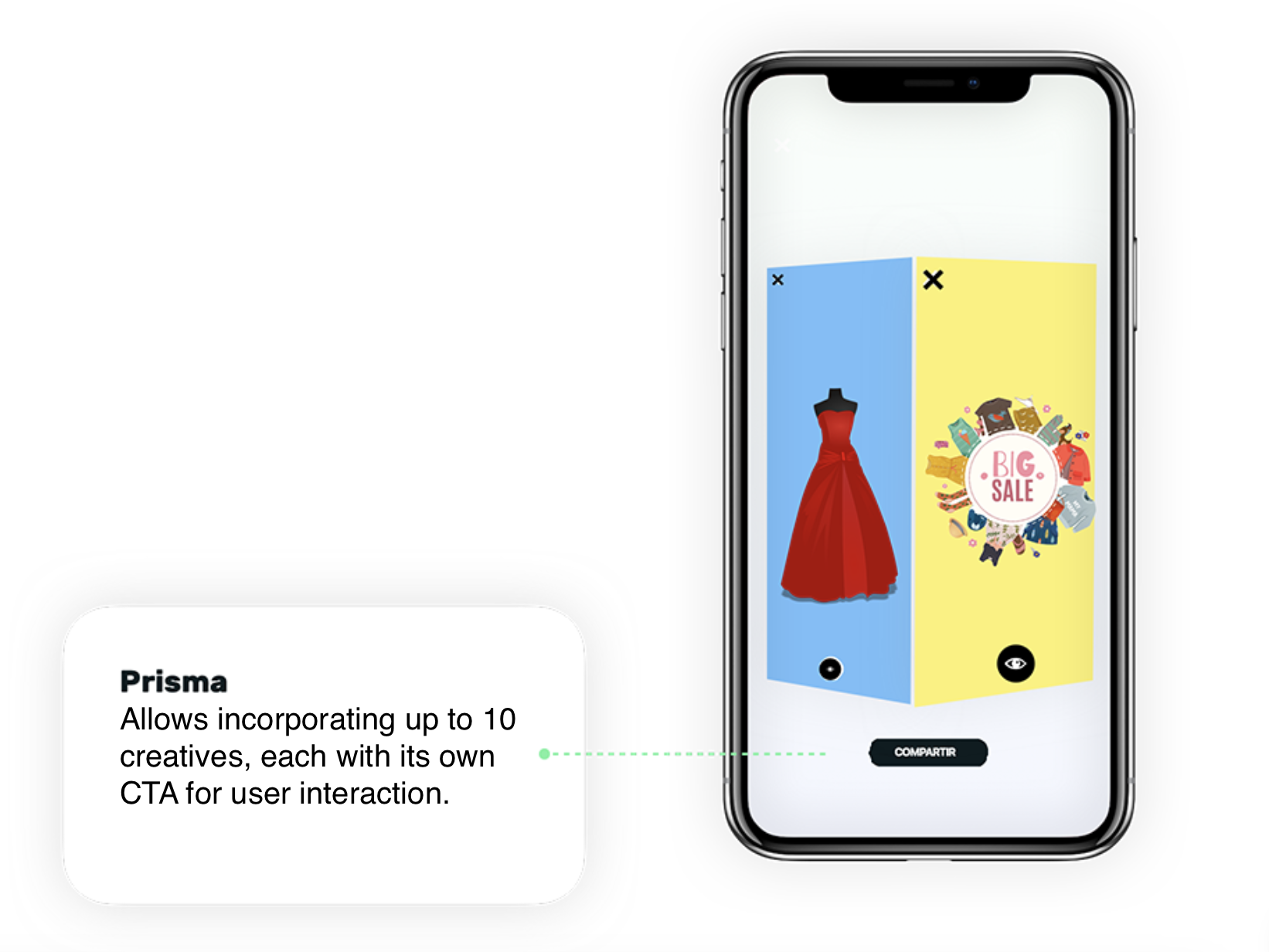
PRISMA is a new and highly innovative In-App communication format, very similar to a StartView, but with a significant difference—it behaves like a Slider and has a 3D style!
Thanks to its design, this format is much more engaging for users and encourages interaction with the communication.
With PRISMA, you can include up to 10 communications/creatives in a single format, each with its own associated CTA.
The specific configuration of PRISMA is as follows:
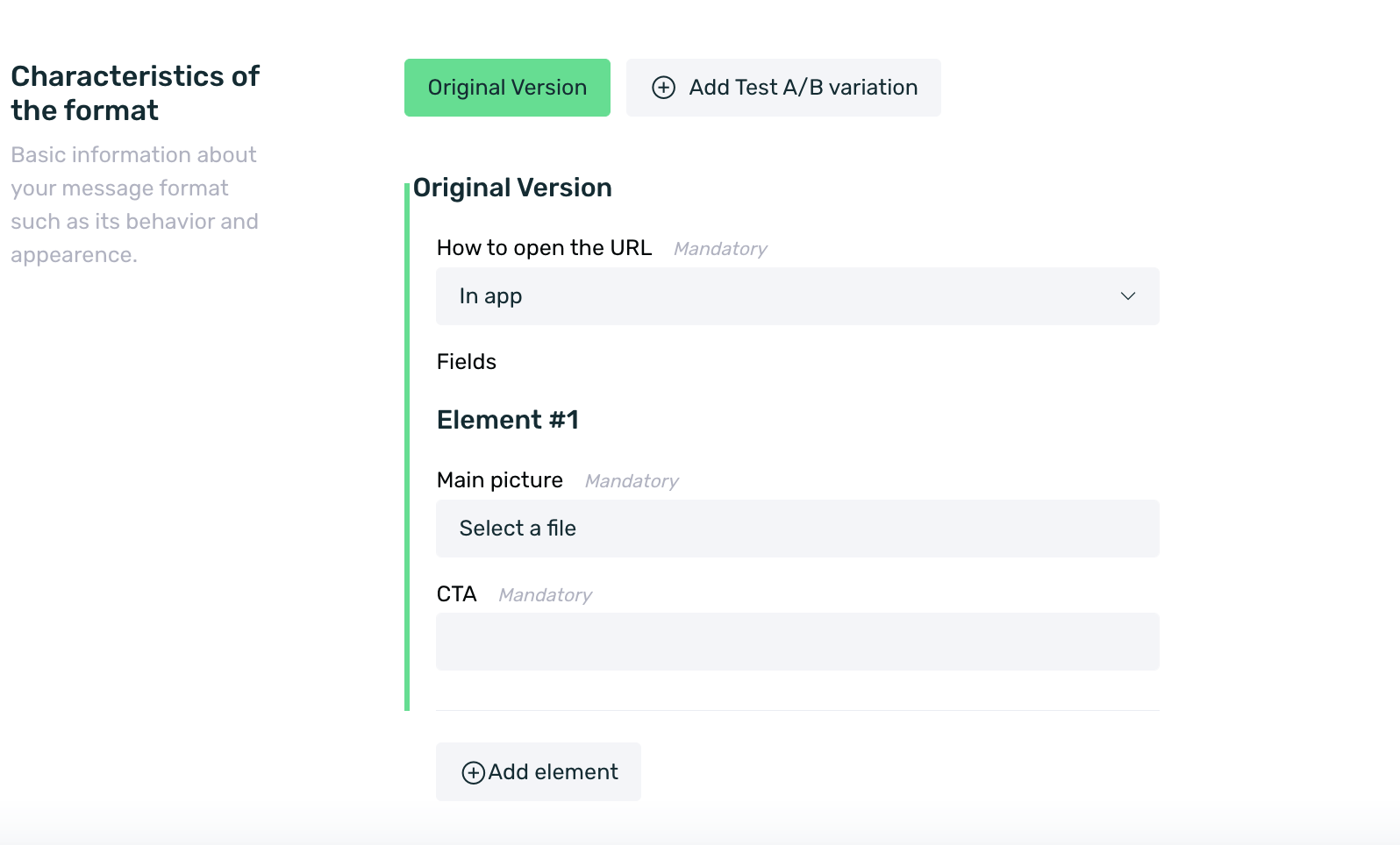
-
How to open the URL: Select the environment where you want the PRISMA redirection to be deployed.
- In App: The configured URL content will open in an embedded webview within the app.
- Default Browser: The configured URL content will open outside the app, in the user's default mobile browser.
-
Frequency: Set the frequency of your Banner. You can find more information about frequency here.
-
Main Picture: Select your creative (jpg, png, or gif) that you want to display on the PRISMA face. You can check the creative specifications here. If the image is larger, it will be center-cropped.
-
CTA: Set the URL or deeplink where the user will be redirected upon clicking.
-
Add Element: Add as many elements as needed for your PRISMA, up to a maximum of 10.
-
A/B Test Variations: If applicable, add the necessary A/B test variations. You can find more information about A/B testing here.
What is an element
An element is each of the blocks that make up the faces of the PRISMA. Each element consists of an image and a CTA.
¶ StartView
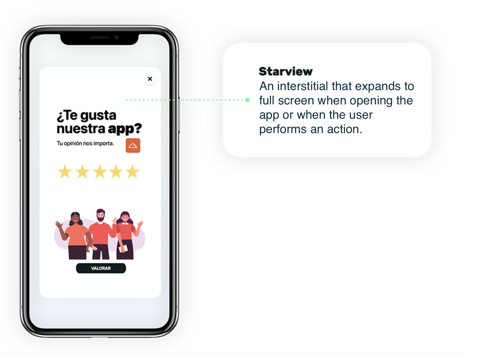
The Startview is an interstitial that expands to full screen and is displayed when opening the app or when the user performs an action, such as opening a specific tab, clicking a button, etc.
For the Startview, unlike other formats, you don't need to upload a graphic file. Instead, you need to enter a URL with the content you want to display in the Destination URL option (it's important that the URL follows the HTTPS protocol). If you want to display a video, and wish for it to appear in full screen, you should use an embedded URL.
In order for the video to display correctly on iOS, you need to add the parameter ?playsinline=1 at the end of the URL. The URL should look like this: https://www.youtube.com/embed/APuWqCmZXyw?playsinline=1.
The minimum size for the interstitial should be 500x750px, but a size of 640x960px is recommended. However, it is advised to develop a responsive layout using HTML and CSS to adapt your format to all screen sizes on the market to avoid display issues.
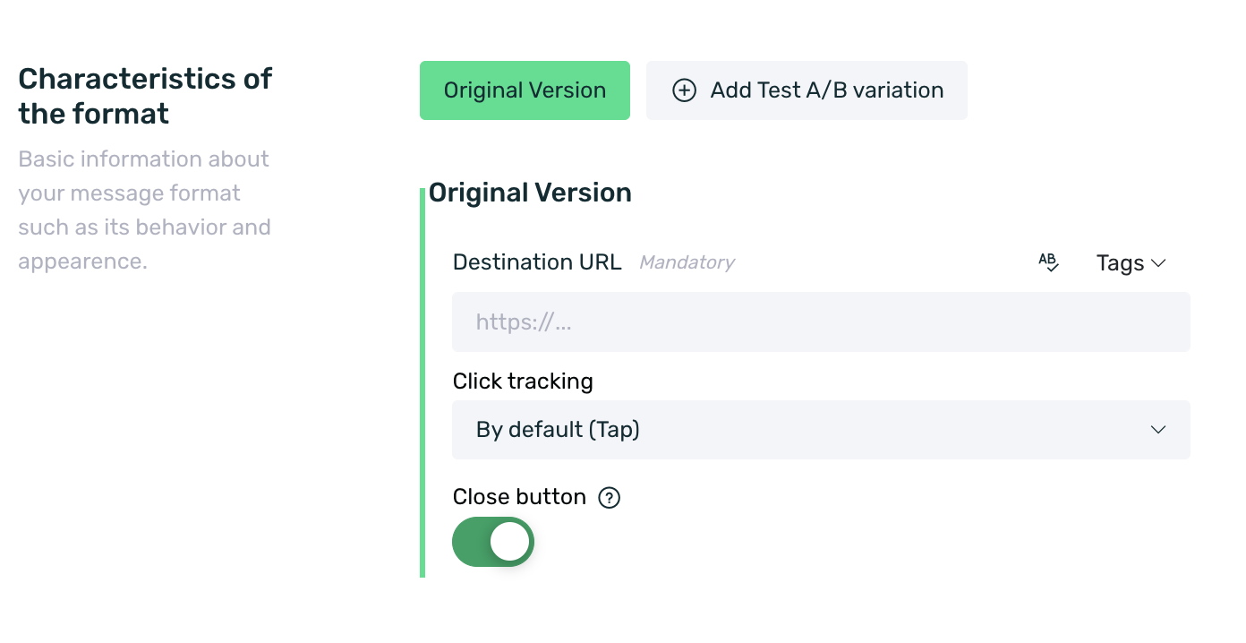
The specific configuration of the Startview is:
- Destination URL: Set the URL you want to be displayed to the user when they view the Startview. This URL can include tags for customization and even parameters with fixed values. For example: https://www.milanding.es?nombre={name}&favorito={local_favorito}&código=123.
The Adball, Banner, and Startview formats allow the use of a substitution engine to attach tags to the URL set in EMMA, enabling the content of the URL to be personalized based on those tags.
In order to perform the personalization, the destination landing page must be able to retrieve the parameter and the tag value in order to use it for the customization.
-
Click tracking: Select the click tracking model for the Startview from the following options:
- Tap: The click will be tracked when the adball is opened. It tracks a click when there is an explicit click on the adball itself.
- URL Change: A click will be tracked for every URL change that occurs within the webview. If a user is navigating the webview and there are 4 URL changes, 4 clicks will be tracked.
- Deeplink: A click will be tracked every time a deeplink is executed from the adball, whether directly (the deeplink is executed when clicking on the adball) or indirectly (a button containing the deeplink on the configured landing page).
- Click on URL: A click will be tracked when the user reaches a specific URL configured in the communication. If this option is selected, we will need to specify the URL to be tracked in the Click on URL field.
-
Close Button: Set whether you want the Startview to have a close button (X icon). If it has a close button, the user will be able to close the Startview and continue browsing the app normally. If there is no close button, the user will not be able to close the Startview and will be stuck in the app until it is closed.
If you want the StartView to close when a CTA is clicked, you need to configure a deeplink on that CTA using the following format:
myapp://startview/close, wheremyappshould be replaced with the identifier corresponding to each specific application.
- A/B Test Variations: If applicable, add the necessary A/B test variations. You can find more information about A/B tests here.
From the app preferences, we can define the default click tracking type for the Adball. Regardless of the type set in this section, we can always modify it when creating the communication to best suit the moment.
You can schedule multiple Startviews simultaneously targeting matching users who may be in different segments, but it’s important to note that if they overlap during the scheduled period, they will follow the same behavior pattern as the other communications: the last scheduled Startview will always take precedence.
You should be aware of the following situations in case of simultaneous scheduling:
- If you have selected a frequency capping, the frequency capping of the last created Startview will always take precedence. This means that even if the first scheduled Startview impacts the same segment, it will not be displayed while the last Startview is active.
- If you don't set any frequency capping (Always) in the last created Startview, and the previous Startviews have the same or a different capping, in both cases, only the last Startview will continue to be shown because its frequency capping still takes precedence.
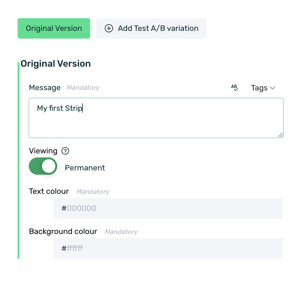
¶ Strip
The Strip is a communication format that occupies the device's notification bar (where the time, battery, etc. typically appear).
With the Strip, the notification bar will be hidden, and a message will appear from right to left with the text you have entered.
The specific configuration of the Strip is as follows:
-
Message: Enter the text you want to be displayed in the Strip.
-
Display Time: Configure the display time for your Strip. Disable the check if you want to set the time (in seconds) for which the Strip will be shown in the app.
-
Text Color: Select the hexadecimal code for the text color of the message.
-
Background Color: Select the hexadecimal code for the background color of the Strip.
It is important to note that due to operating system limitations, the Strip format in iOS is only available on models equal to or later than the iPhone X.
¶ Frequently Asked Questions
1. When accessing the Communication > Messages section, I see an error on the dashboard and when creating a native ad, the templates do not appear in the list.
If you're seeing an error like this or something similar, and you can't select a native ad template, it is likely due to having an AdBlocker installed in your browser that interferes with the proper functioning of EMMA.
Uninstall or disable the AdBlocker, and you should no longer experience issues.
2. Can I add an animated gif in in-app formats?
The only formats that currently allow an animated GIF are:
- Banner: There are no limitations, and it is allowed on both Android and iOS.
- Prisma: Due to operating system limitations, it is currently only possible to use an animated GIF on Android. On iOS, it will display as a static image.
3. Which in-app formats are available to be used in customer journeys?
All in-app formats can be used for customer journeys.
4. Which in-app formats allow the creation of A/B test variations?
The possibility to add A/B test variations is available in all of our in-app communication formats.
5. What can be configured in the CTA field?
Most in-app formats allow the use of a URL or a deeplink. You can find more information about this in each specific format.
Depending on the need, you can configure a classic URL, such as https://emma.io/, or, in formats that allow it, a deeplink, for example, miapp://settings, to redirect users to a specific section inside your app.
6. What dimensions should the creatives for each of the available in-app formats have?
Each format has its characteristics and allows a specific size. In this article, you can see the recommended dimensions for each of the communication formats available in EMMA.
7. Is any implementation needed in the app to use the PRISMA format?
Yes, a small integration of our SDK is required for this new format, just like for other formats offered by EMMA. This guide details the integration process for Android and iOS, and this repository contains the integration examples for both platforms.
8. How many faces can my Prisma have?
Prisma allows adding a maximum of 10 faces/creatives, each with its own associated CTA.
9. In Prisma, can I swipe up for redirection?
No. To execute the redirection configured in the CTA, it is necessary to tap the eye icon located at the bottom of the Prisma.
10. In the Prisma format, is the slider movement unidirectional or bidirectional?
The movement is bidirectional; you can swipe the Prisma from right to left or vice versa, from left to right at any time.