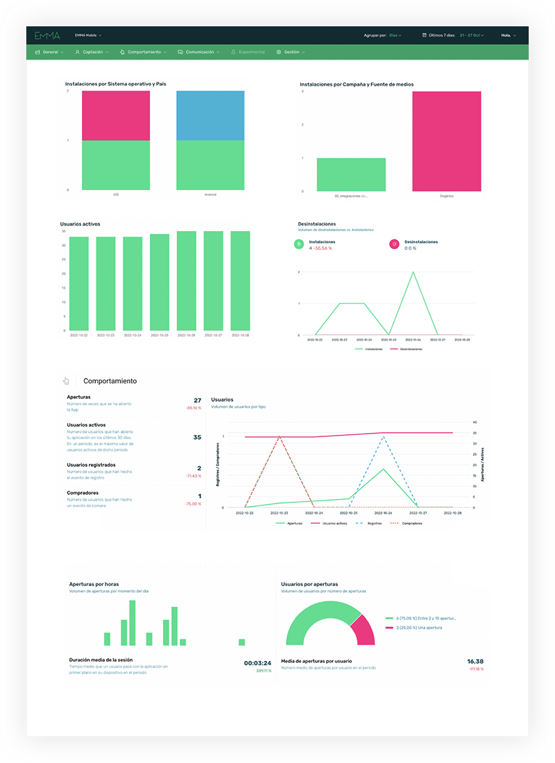
In the dashboard, you can quickly and visually access all the data about your application, providing you with a global overview of everything happening within the app, similar to the Executive Summary. The main and significant difference from the Executive Summary is that this screen allows you to customize the graphs to view the most relevant data for your app. Below, we explain how to customize your application’s data.
¶ Create dashboards
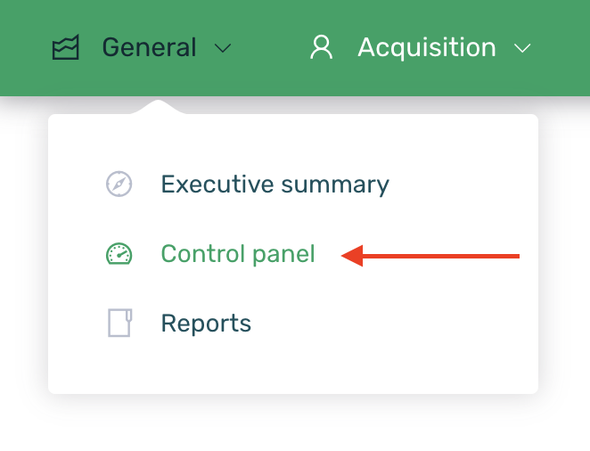
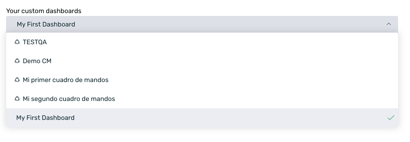
Log in to EMMA and navigate to the General > Custom Dashboards section.
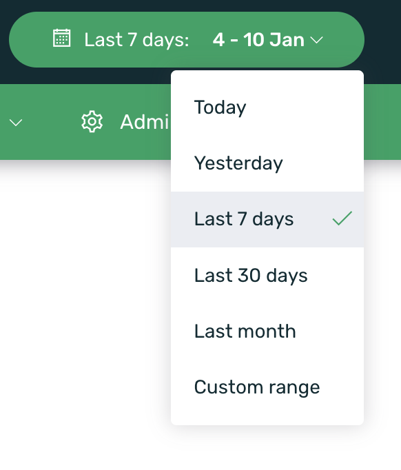
As in all EMMA screens, the data is displayed based on the selected date range, allowing you to choose between default intervals or specify a custom date range. You can find more information about date filtering here.
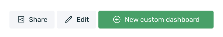
The first step is to create a new Dashboard where you can add all the components you want to display information for. If you have never created a dashboard before, by default, you will already be in the creation form when you access this screen. If you have previously created a dashboard, simply click the + New Dashboard button on the right side of the screen to access the creation form.
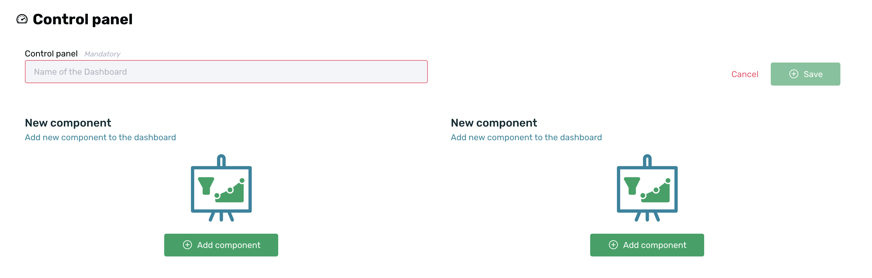
Next, you can start adding all the components you need for your dashboard. To do this, simply click the + Add Component button and fill out the creation form with the relevant data for each specific case.
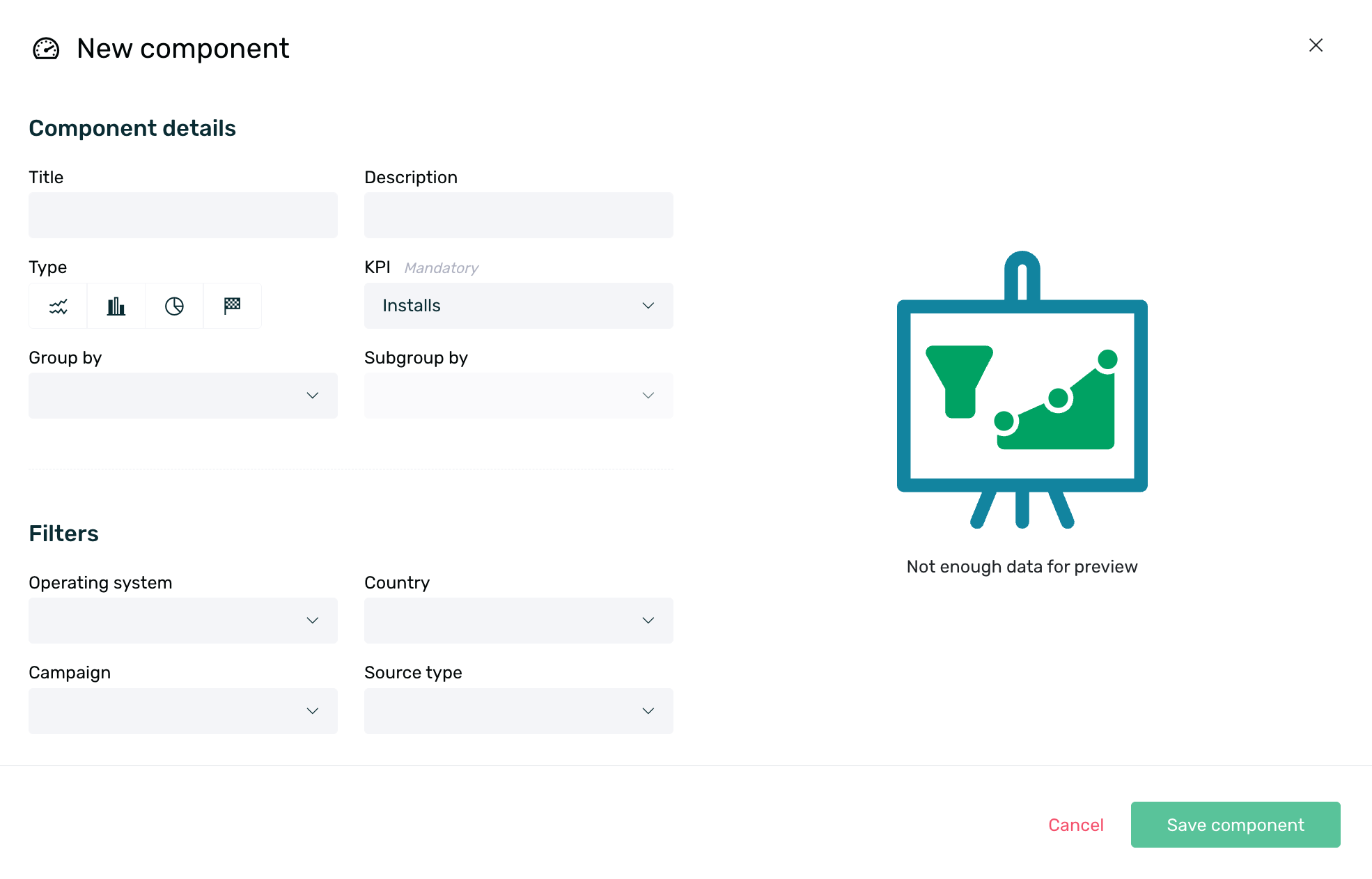
- Title: Optionally set an identifying title for your new component.
- Description: Optionally provide a description for your new component.
- Type: Select the type of chart in which you want the data to be displayed. You can choose from the following options:
- Line chart
- Bar chart
- Donut chart
- Counter
The donut chart type has a limit of 10 sections/slices. If your grouping returns a result with more than 10 variables, not all of them will be displayed in the chart.
KPI: Select the KPI from which you want to obtain information from the following options:
Group by: Grouping is only available for bar and donut charts. You can choose to display the data grouped by the following elements:
- Date: Group data by date.
- Operating System: Group data by operating system (Android or iOS).
- Country: Group data based on the country linked to the device.
- Campaign: Group data by the name of the Apptracker campaign. More information on campaign management here.
- Source Type: Group data based on its origin, either organic or campaign.
- Media Source: Group data by the provider selected when creating the Apptracker source. More information on source management here.
- Source: Group data based on the name assigned to the Apptracker source. More information on source management here.
Subgroup by: Subgrouping is only available for bar charts. You can choose to display the data subgrouped by the following options:
- Operating System: Subgroup data by operating system (Android or iOS).
- Country: Subgroup data based on the country linked to the device.
- Campaign: Subgroup data by the name of the Apptracker campaign. More information on campaign management here.
- Source Type: Subgroup data based on its origin, either organic or campaign.
- Media Source: Subgroup data by the provider selected when creating the Apptracker source. More information on Apptracker source management here.
Additionally, certain filters can be applied (or not) to obtain granular information based on specific needs:
- Operating System: Filter by Android or iOS to only show data for one or the other.
- Country: Filter information by country to only show data for a specific country. Only one country can be selected at a time.
- Campaign: Filter by a specific campaign to only show data from that campaign. More information on campaign management here.
- Source Type: Filter by Organic or Non-organic to obtain only organic or campaign data.
Once the component is configured, click the Save Component button to save the changes. You can add as many components as you need. After adding all the desired components, assign an identifying name to your dashboard and click the + Save button on the right side of the screen.
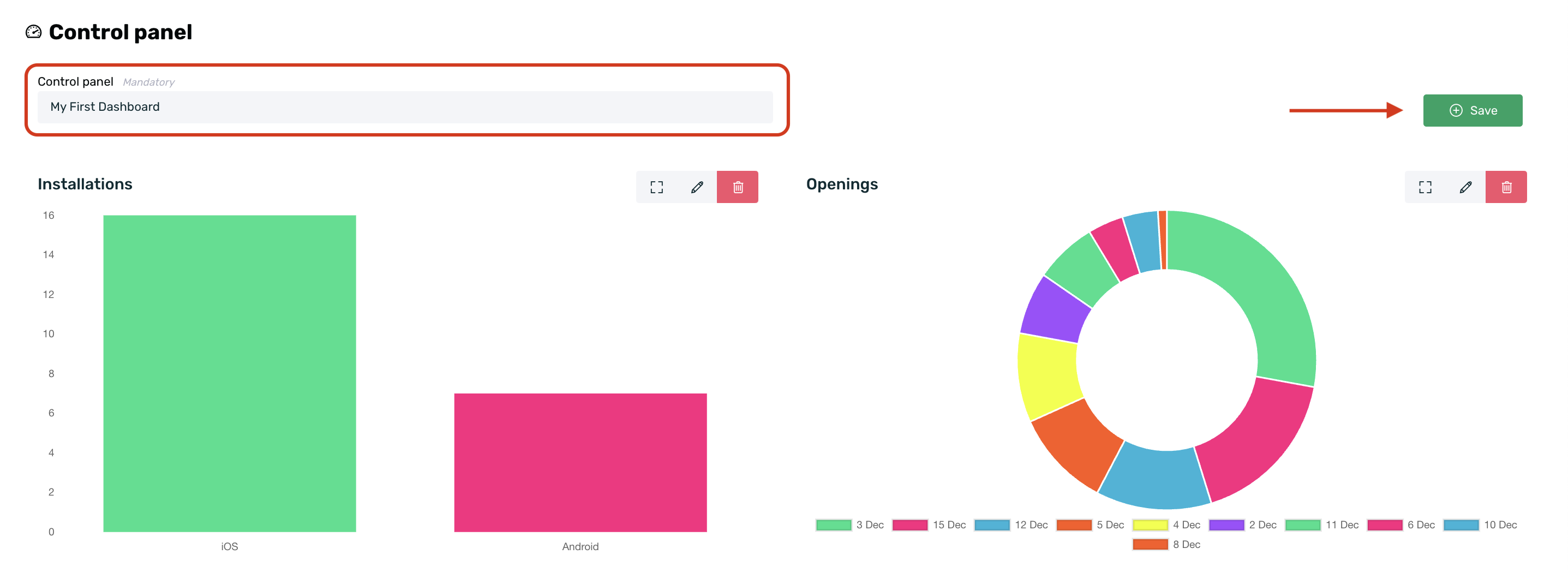
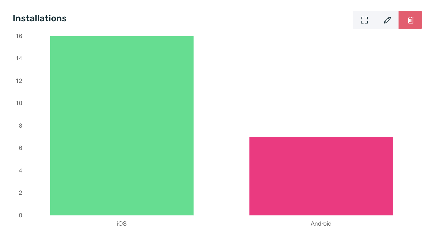
You can expand the component using the square icon, edit it to change the settings by clicking the pencil icon, or delete it by clicking the trash can icon. If you choose to delete the component, you will need to confirm the action by accepting a pop-up confirmation to proceed with its deletion.
¶ Share Dashboards
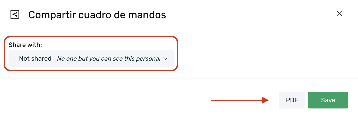
Once your dashboard is saved, by default it is an unshared dashboard, meaning only the user who created it has access to it. However, if you want to share it with other users, simply click the Share button on the right side of the screen.
Next, a pop-up will appear where you can select how you want to share your dashboard. The available options are:
- Unshared: Default option. Only the user who created the dashboard will have access to it.
- Private: In addition to the dashboard creator, only users specifically granted access will be able to access it.
- Shared: Any user with access to the app will be able to access this dashboard.
It's easy to tell whether a dashboard is unshared, private, or shared:
- Unshared dashboards will not display anything next to the name.
- Private dashboards will show a lock icon next to the name.
- Shared dashboards will show a share icon next to the name.
Once you've configured your settings, click the Save button.
Additionally, if necessary, you can also download a PDF file with the content of your dashboard and the respective information for the selected date range. To do this, simply click the PDF button in the dashboard sharing pop-up.
¶ Delete and edit dashboards
The dashboards you create can be edited to make any necessary modifications or deleted, but only the user who created the dashboard can perform these actions.
To edit your dashboard, simply select the dashboard in question and click the Edit button on the right side of the screen. This will allow you to individually edit each component, delete them, or add new components.
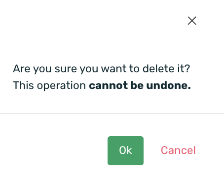
To delete your dashboard, you must select the dashboard in question, click the Edit button, and then click the Delete button.

A confirmation pop-up will appear to delete the dashboard. Click on the OK option to delete it, or click Cancel to keep the dashboard.