¶ Introduction
The executive summary allows you to review the main activity of your app in a unified view on a single screen. It is the quickest and easiest way to access your app's key performance indicators (KPIs) and track their evolution over time.
It is important to note that this is a reporting screen, and the data displayed is not in real-time; the information is updated every 3 hours.
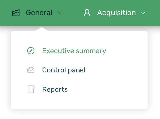
Log in to EMMA and go to the General > Executive Summary section.
The data displayed by EMMA will always correspond to the selected date range and will be visualized in the charts based on the selected grouping type (days, weeks, or months).
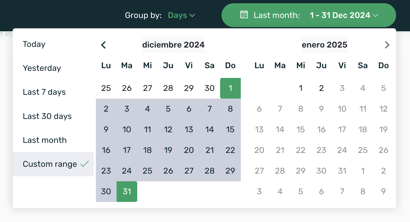
The available date ranges to filter the data are:
- Today
- Yesterday
- Last 7 days
- Last 30 days
- This month
- Last month
- Custom range
Once the desired date range is selected, you will see that the three KPIs located at the top of the page have updated their information:
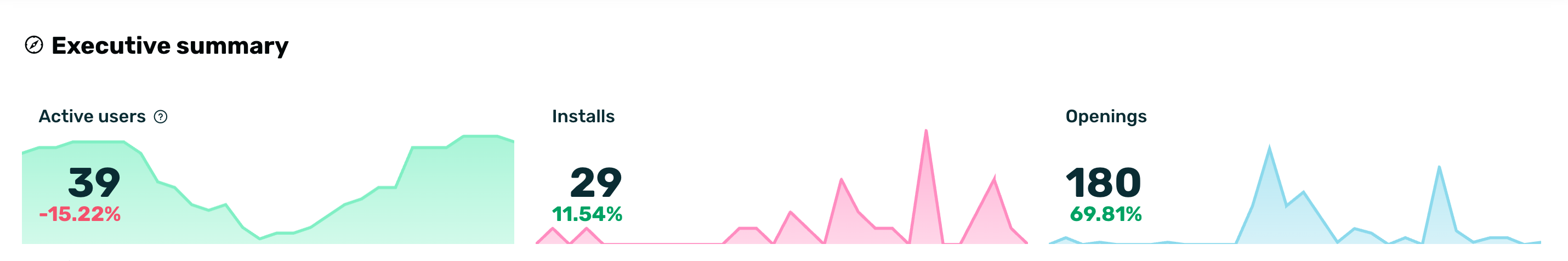
| Active Users* | Users who have opened the app in the last 30 days. When selecting a specific date range, the maximum number of MAUs for that range is displayed. This data is calculated using the information from the Last Session KPI. |
| Installs | Users who have opened the app for the first time within the selected time interval. |
| Openings | App openings during the selected date range. |
*To calculate the MAUs, EMMA has day-by-day data. When a specific date range is selected, EMMA shows the data for the day with the highest number of MAUs within that range.
For example, in the range from June 3 to June 6, the MAUs for each day are:
- June 3: 100 MAUs
- June 4: 137 MAUs
- June 5: 92 MAUs
- June 6: 108 MAUsWhen selecting this date range, the information displayed on the dashboard will be 137 MAUs, as it represents the maximum MAUs within the selected date range.
Similarly, each of the sections that make up the executive summary will have updated the information to display based on the previously selected date range and grouping type. Next, we will take a closer look at each of the 4 sections that form this screen:
¶ Acquisition
In the Acquisition section, you can view data about users coming from your campaigns, meaning users attributed in the EMMA Apptracker.
¶ Installs
The Installs chart shows the total number of installs of your app, along with a breakdown by source, as well as the percentage variation compared to the immediately preceding period.
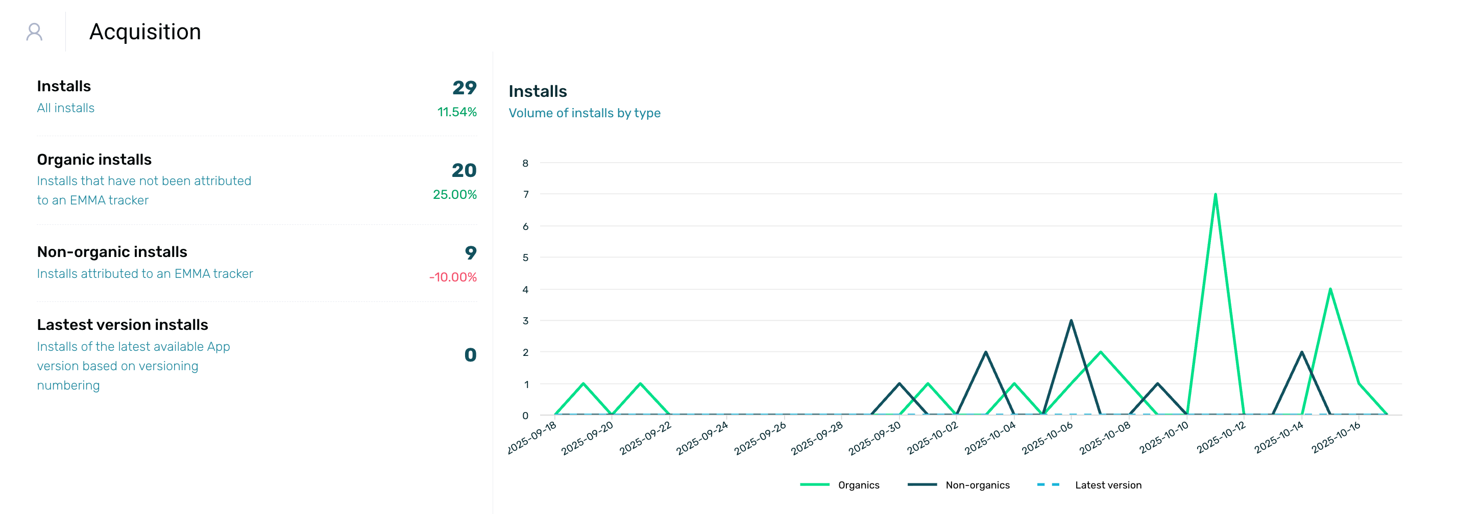
| Installs | Users who have opened the app (i.e., app installs) for the first time during the selected date range. |
| Organic installs | Installs generated organically. |
| Non-organic installs | Installs generated by paid campaigns. |
| Latest version installs | Users who have opened the latest version of the app (i.e., app install) registered in EMMA for the first time during the selected date range. This version usually matches the one available in the stores, but if a development version with a higher number is compiled, data for that version will be displayed. |
¶ Main Media Sources
In the following chart, we can see the best media sources and the volume of installs each of them has achieved.
In the center of the chart, the total number of installs generated by the media sources during the selected date range is displayed, along with the percentage variation compared to the previous period. Additionally, you can hover over the different areas of the chart to view the number of installs from each source.
Only the top 6 media sources are displayed, meaning the ones that have generated the highest number of app installs during the selected date range.>
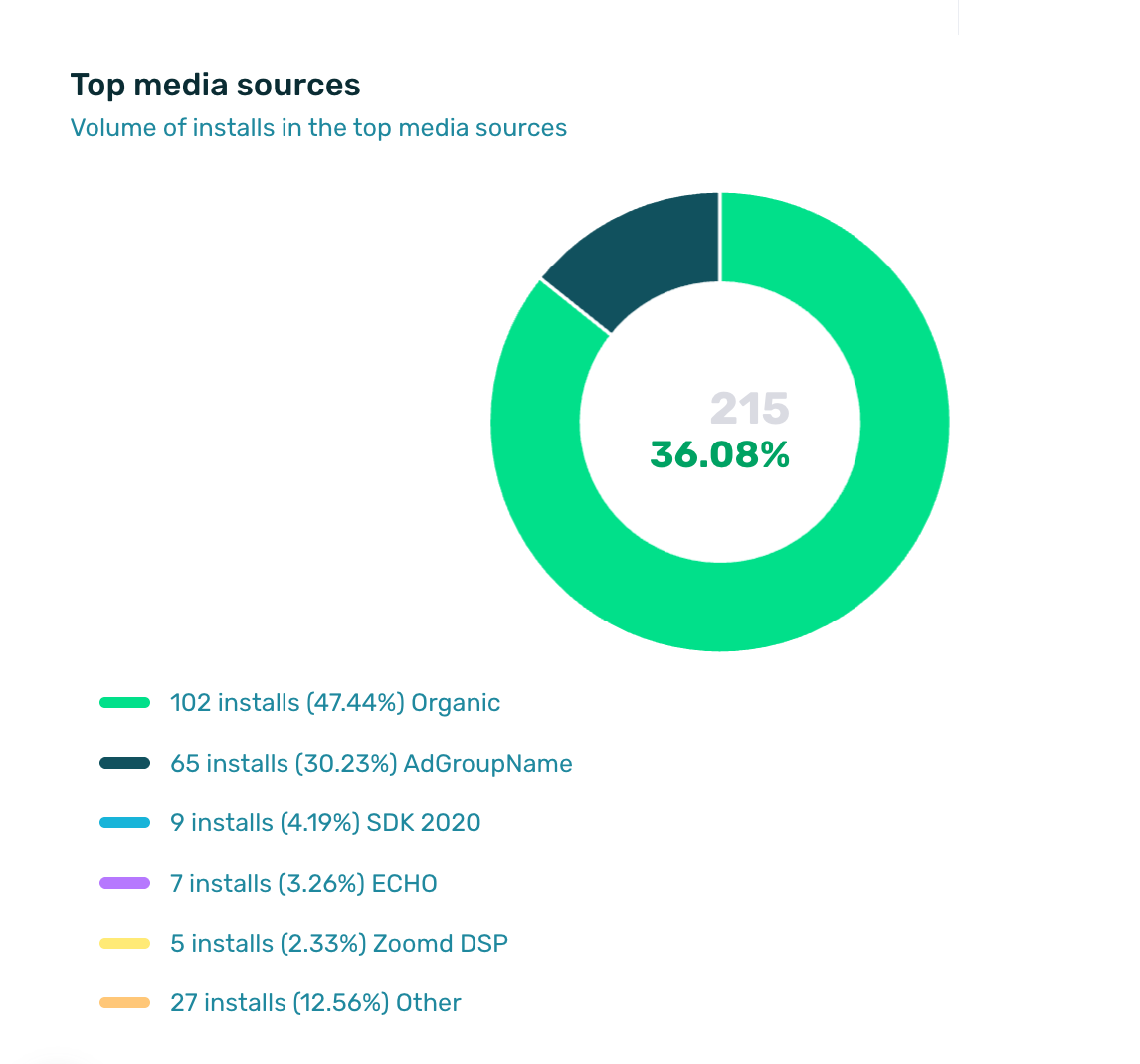
In the chart legend, we can see each of the 6 media sources listed, along with their name, the number of installs, and the percentage that this volume represents out of the total installs from these media sources.
¶ Behavior
In the Behavior section, the data corresponding to this part of the tool is displayed, which covers user behavior within the app.
¶ Users
The first chart shows the volume of users based on their behavior within the app. You can select different areas of the chart to view data on:
- Openings
- Active users
- Registered users
- Buyers
This chart is accompanied by an explanatory index that reflects the total volume of users according to their behavior type and the variation compared to the previous period.
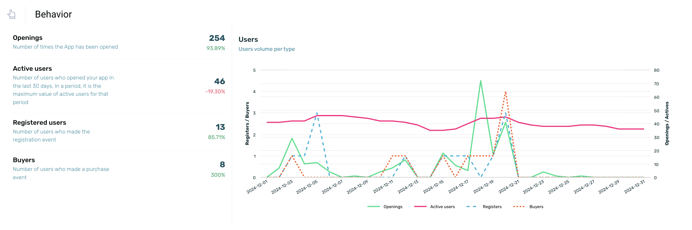
| Openings | The number of times the app has been opened during the selected time period. |
| Active users | The number of users who have opened the app at least once within a 30-day period. When selecting a specific date range, the maximum number of MAUs for that range is displayed. You can find more information about what is shown here. |
| Registered users | Users who have registered directly through the app or mobile site during the selected date range. |
| Buyers | Users who have made a purchase event through the app or mobile site during the selected date range. |
TIP: Use EMMA's default events to send activity related to registrations and sales so that these KPIs are displayed in the executive summary.
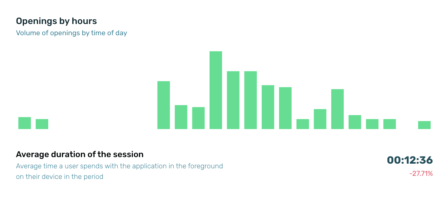
¶ Openings by Hour
The bar chart shows the volume of app openings by time of day. To see the number of sessions per hour, you need to hover the cursor over the chart.
At the bottom, the average session duration is displayed, which refers to the amount of time a user spends with the app in the foreground on their device during the selected period.
¶ Users by openings
The chart on the right shows the volume of users by the number of openings. At the bottom, the average number of openings per user during the period is displayed.
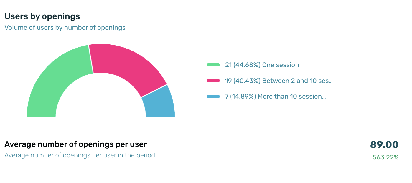
When calculating the average over several days, the individual average for each day is taken, and sessions are used to compute a weighted average.
¶ Communications
In the Communications section, the results of the campaigns conducted during the selected time period are displayed, including both Push notifications (shown in the first chart) and in-app messages (shown in the second chart on the screen).
¶ Push Notifications and Revenue
The first chart provides information on Push Notifications and Revenue, specifically the volume of Push Notifications sent compared to the revenue generated. It is accompanied by an index with brief explanations of the types of push notifications displayed in the chart and the associated sales and revenue.
This is an interactive chart, so you can hover your cursor over it to view different areas. Specific data for the selected period will be displayed.
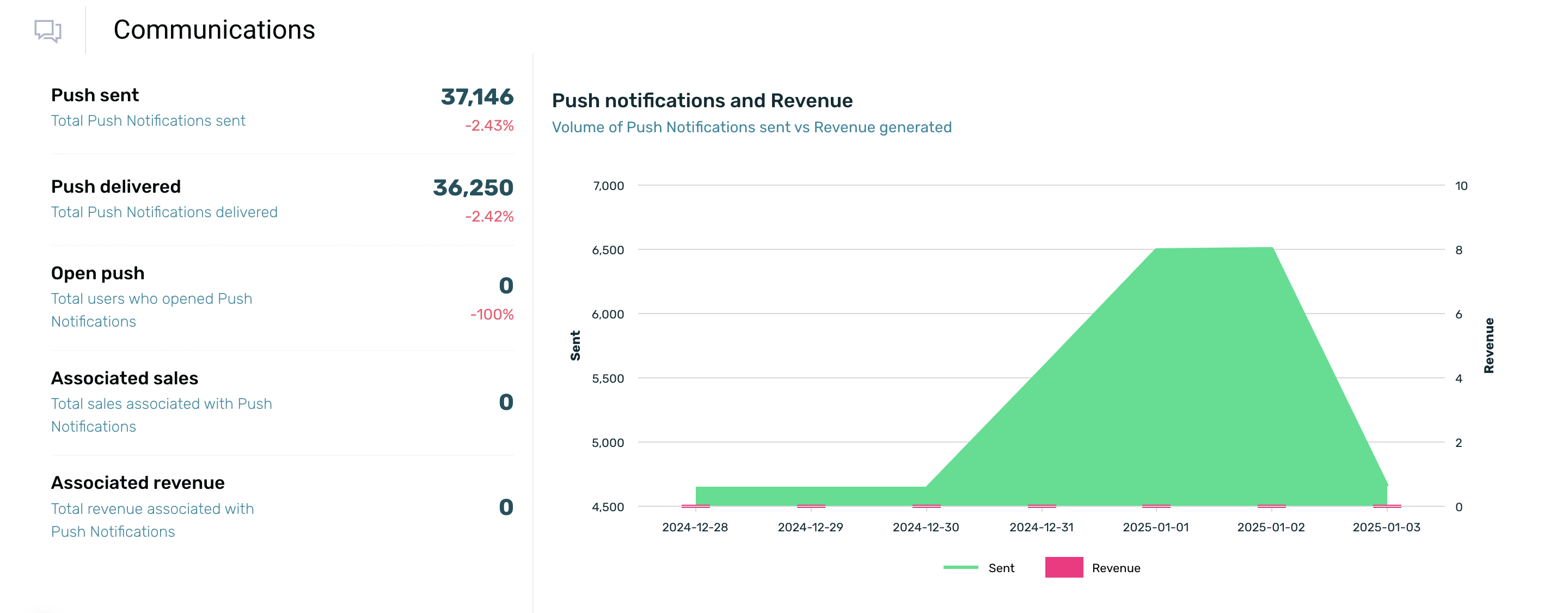
| Push sent | Total number of Push Notification campaigns sent during the selected date range. |
| Push delivered | Total number of Push Notifications delivered to devices during the selected date range. |
| Open push | Total number of users who opened a Push Notification during the selected date range. |
| Associated sales | Total sales attributed to Push Notifications during the selected date range. |
| Associated revenue | Total value generated through Push Notification sales during the selected date range. |
¶ In-App Messages
The second chart shows the In-App messages you have scheduled in your app under Communication > Messages. To view the exact number of impressions, unique impressions, clicks, and applied coupons for a specific time period, simply hover over different areas of the chart. This chart includes an explanatory index to help quickly and easily understand the actions related to In-App Messages being measured.
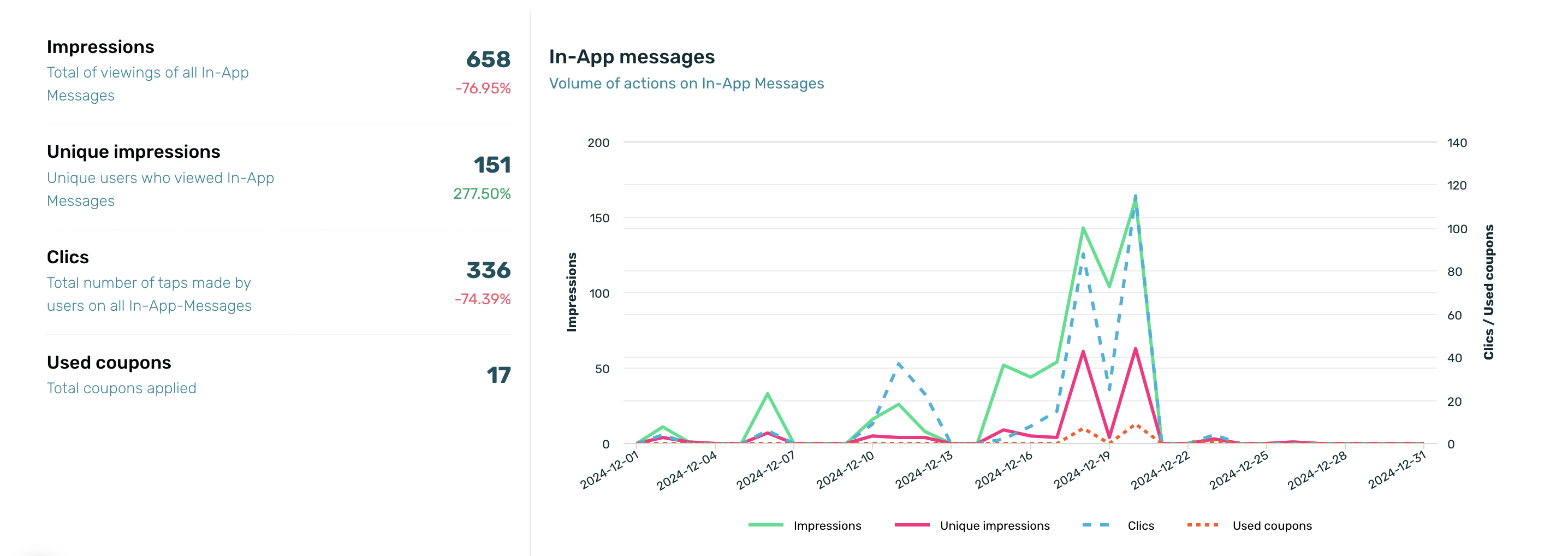
| Impressions | Total number of users impacted by In-App communications during the selected date range. |
| Unique impressions | Number of unique users who have viewed the In-App Messages during the selected date range. |
| Clics | Total interactions generated with In-App communications during the selected date range. |
| Used coupons | Total volume of coupons used by users. |
¶ Sales
In this section, you’ll see the total revenue generated from sale events, along with the total number of sales and the relationship between the number of sales and the revenue they generated.
TIP: Use EMMA's default event to send activity related to sales so that this KPI and its attributes are displayed in the executive summary.
¶ Revenue
In the Revenue section, located at the top left of the screen, you’ll find a breakdown of the total revenue generated from sale events, along with the total sales value (shown below) and the total number of completed sales.
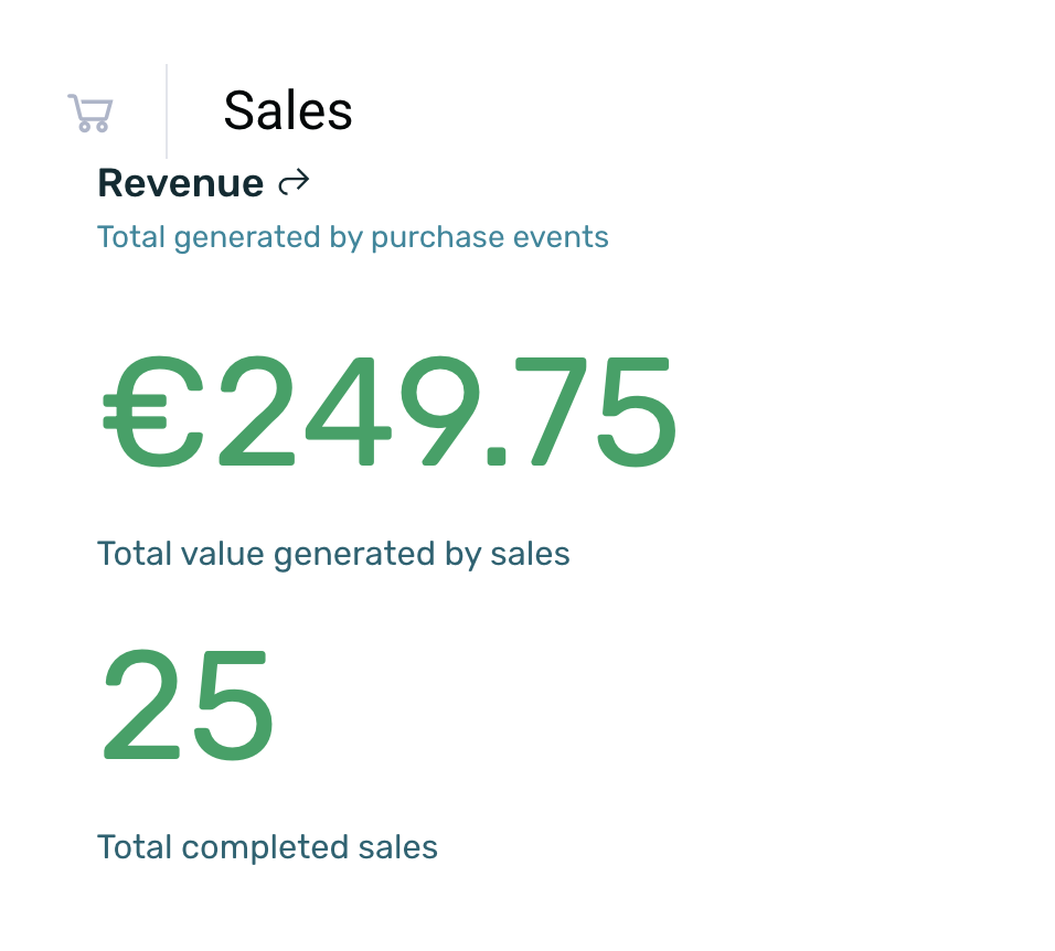
| Total generated by purchase events | Total value generated through purchases during the selected date range. |
| Total value generated by sales | Total number of orders placed during the selected date range. |
| Total completed sales | Total number of completed sales within the app during the selected date range. |
¶ Sales
This section (located to the right of the "Revenue" section) provides a summary of the total number of sales during the previously selected time period.
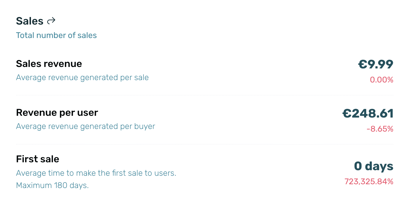
| Sales revenue | Average value per sale during the selected date range. |
| Revenue per user | It corresponds to the average value of revenue generated per buyer. |
| First sale | Average number of days from the app install or the first visit to the mobile site until the first sale. Information is available for a maximum date range of 180 days.. |
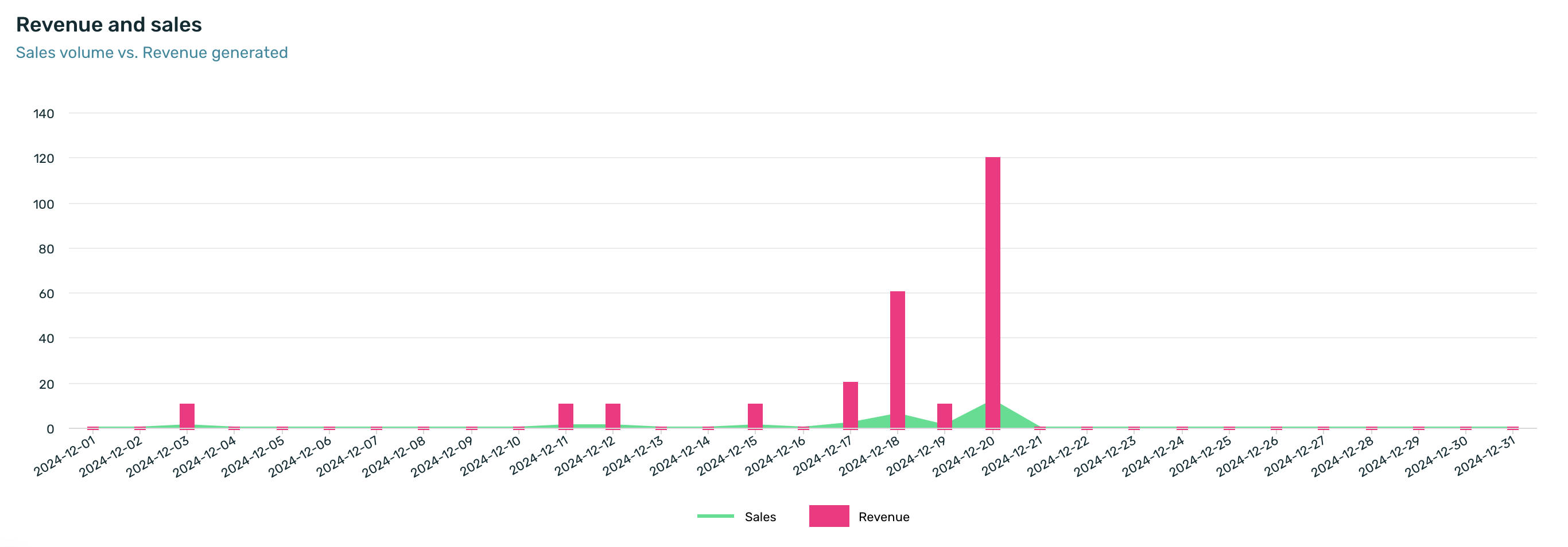
¶ Revenue and sales
The bar chart shows the relationship between the volume of sales and the revenue generated during the selected time period.