¶ Cohorts
The Cohorts screen allows you to examine the behavior of user groups over time. A cohort is a group of users who share a common characteristic (such as having installed the app or made a purchase) within the same time period.
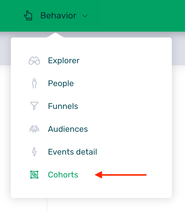
To access this screen, simply follow these steps:
-
Log in to your EMMA account.
-
Go to the Behavior > Cohorts section.
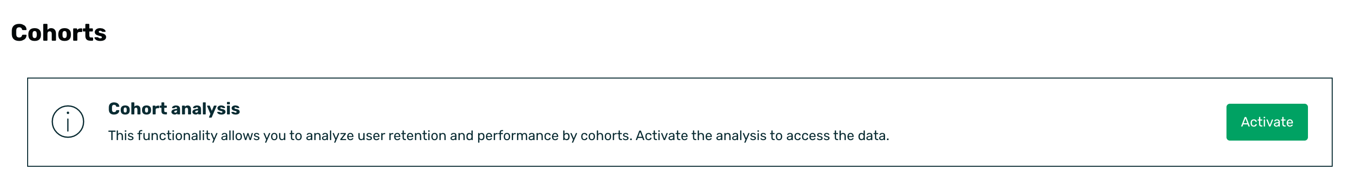
To perform queries and analyses on this screen, click the Activate button that appears in the notice when entering this section.
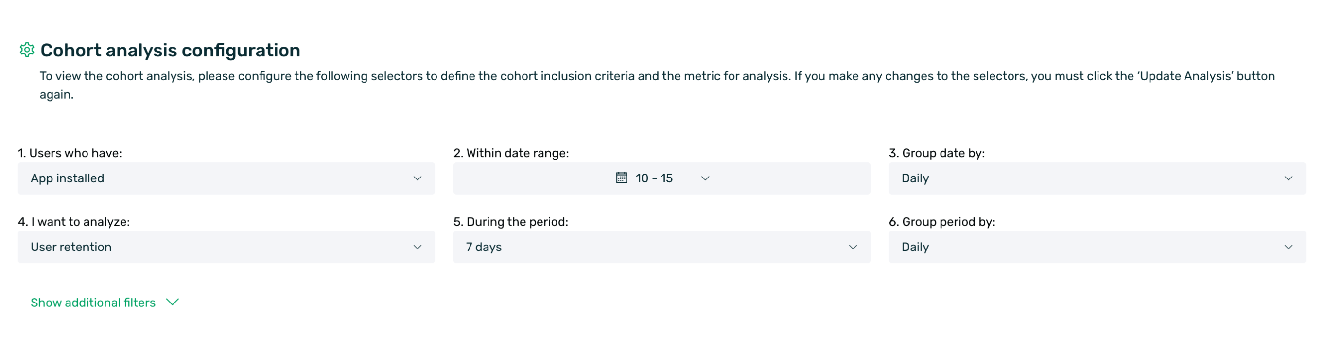
¶ Cohort analysis configuration
To view the analysis, you must configure a series of selectors that define both the inclusion criterion (who is part of the cohort) and the metric you want to analyze (what those users did afterward).
If you make any changes to the selectors during your query, remember to click the Update analysis button located on the right to refresh the data.
The configuration is divided into 6 steps:
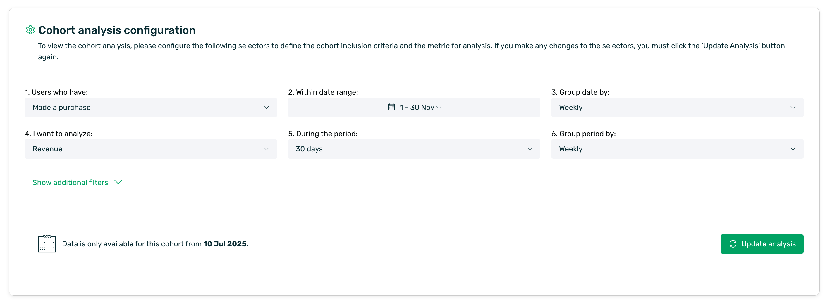
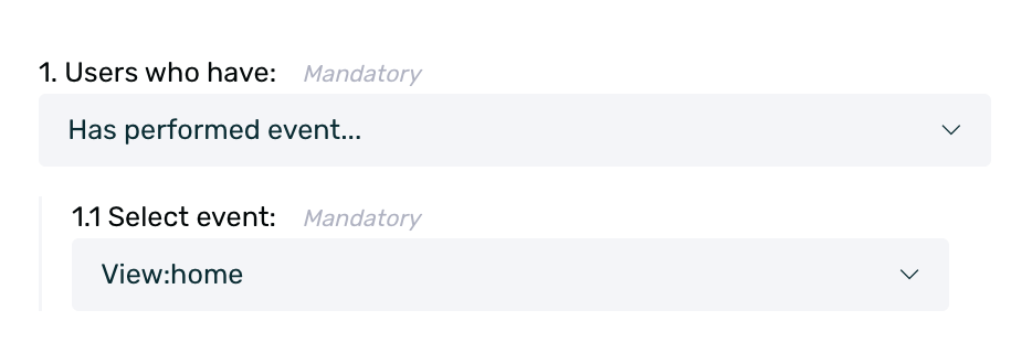
1. Users who have: Here you must define the triggering event that groups the users. Users who perform this event within the selected date range will be part of the cohort.
The available options are:
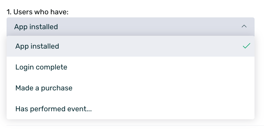
- App installed
- Login complete
- Made a purchase
- Has performed event: This option allows you to select a custom event from your app.
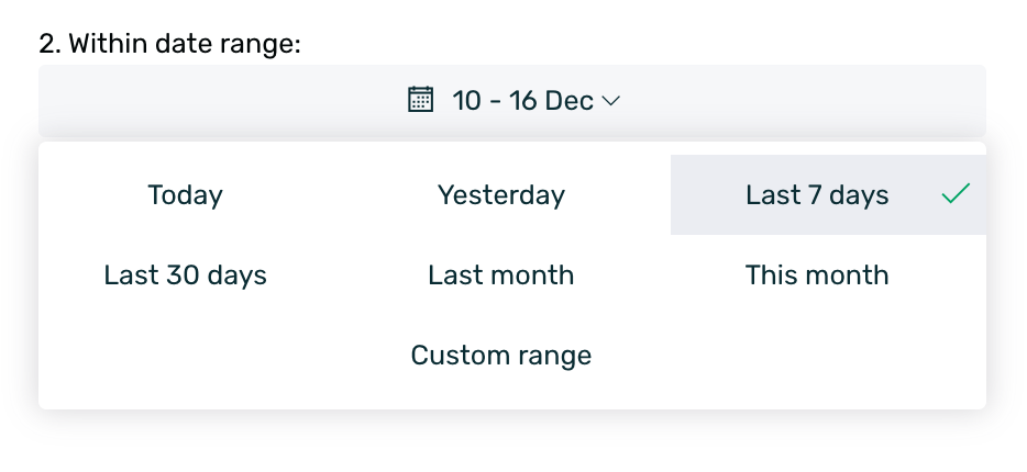
2. Within date range: Define the time period in which users must have performed the event from step 1 to be included.
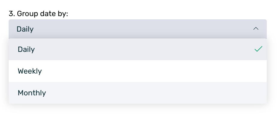
3. Group date by (Rows): Determines how the rows of your results table will be divided.
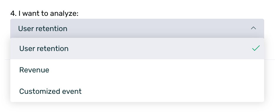
4. I want to analyze: Here you must define what data you want to observe about the previously selected users.
-
User retention: Shows what percentage of users returned to use the app.
-
Revenue: Shows the monetary value generated by those users.
-
Customized event: Similar to the inclusion criterion, this option allows you to analyze the repetition or execution of a specific custom event.
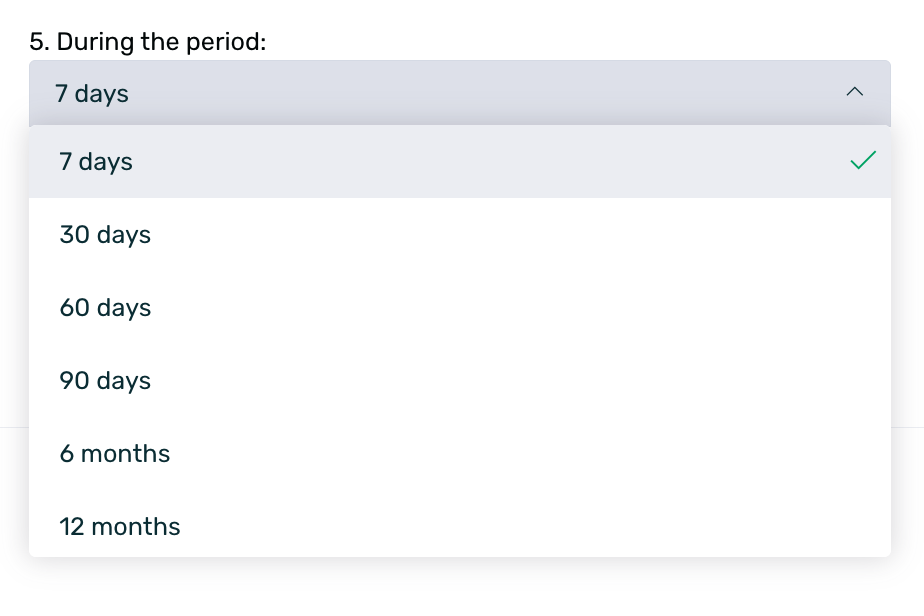
5. During the period (columns): Establish the length of the temporal axis for the analysis. Define the future duration for observing the cohort's behavior.
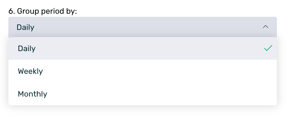
6. Group period by (Columns): Define the granularity of the time columns.
¶ Additional filters
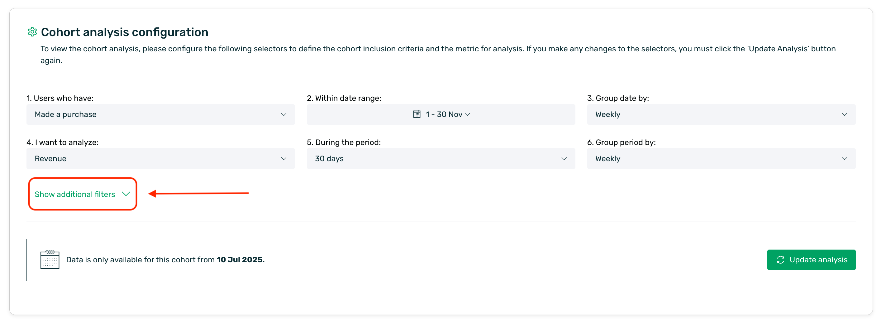
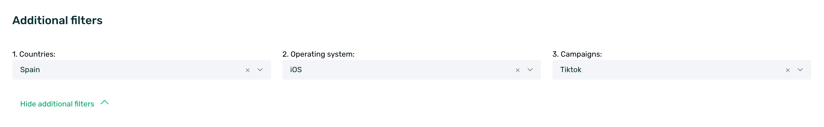
If you require a more segmented analysis, you can expand the Show additional filters option. This will allow you to refine the cohort based on:
-
Countries: Filter by the users' geographical location.
-
Operating system: Android, iOS, or other.
-
Campaigns: Isolate traffic originating from specific acquisition campaigns.
¶ Results table
Once the analysis is configured and the Update analysis button is clicked, a table will be generated, allowing you to visualize the evolution of the metrics.
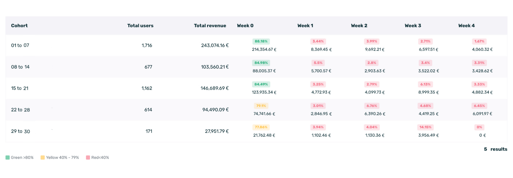
¶ Summary columns
Prior to the temporal breakdown, the initial columns of the table provide a global summary of each cohort, offering context regarding its volume and value.
-
Total users: Displays the number of unique users who met the conditions on that specific date or period. This represents the cohort size.
-
Total revenue: Indicates the total monetary sum generated by this cohort throughout the entire selected period. This assists in identifying the most profitable user groups (Visible when analyzing Revenue).
-
Total events: Indicates the total number of times the target event was performed by users within that cohort (Visible when analyzing Customized event).
¶ Temporal breakdown
The remainder of the table shows the evolution of the selected metric:
-
Rows (Cohorts): Each row represents a group of users who performed the initial event on the indicated date.
-
Columns (Periods): Represent the time elapsed since the initial event.
-
Cells: The value within the cell indicates the performance of that cohort during that specific period.
¶ Color classification
To facilitate quick reading, the table utilizes a traffic light color code to indicate metric performance:
-
Green: Indicates high performance (Above 80%)
-
Yellow: Indicates medium performance (Between 40% and 79%).
-
Red: Indicates low performance (Below 40%).
¶ How to analyze the data
¶ Post-install retention analysis
In this scenario, the objective is to analyze user behavior during the initial days of the life cycle. We aim to determine whether users return to the application on the day immediately following install or if they churn after the first session.
For this short-range analysis, the selectors have been configured with daily granularity:
-
Inclusion criterion: Users who have Installed the app within a specific period, from the 11th to the 15th of month X.
-
Cohort grouping: Daily. Here, we aim to observe the specific performance for each day of the week.
-
Metric: User Retention.
-
Lookback period: 7 days with Daily grouping. We are interested in the immediate future (the first week).
Upon generating the table, we obtain a detailed view of the initial behavior. Let's analyze the first row as a reference:
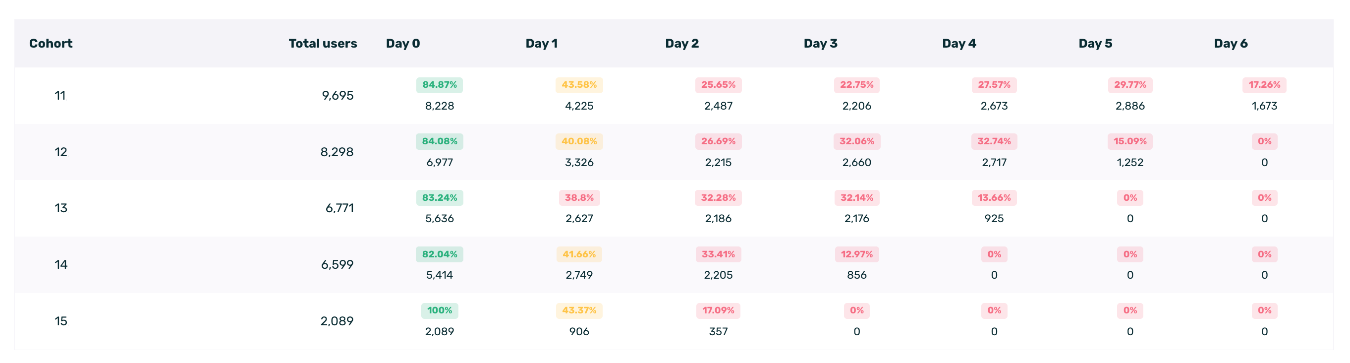
-
Cohort (Day 11): Represents the 9,695 users who installed the app on that specific date.
-
Day 0: Of the total installs, 84.87% had activity recorded on that same day as active users.
-
Day 1: This is the critical data point for onboarding. Only 43.58% of users reopened the app the day after install.
-
Day 2 to Day 6: We observe the curve stabilizing, moving from 25.65% on Day 2 to 17.26% by Day 6.
¶ Recurring revenue analysis
In this second case study, we will analyze the monetary value generated by users over time. The goal is to understand the continued spending behavior of users who made an initial purchase within a specific period.
To retrieve this data, the selectors have been configured as follows:
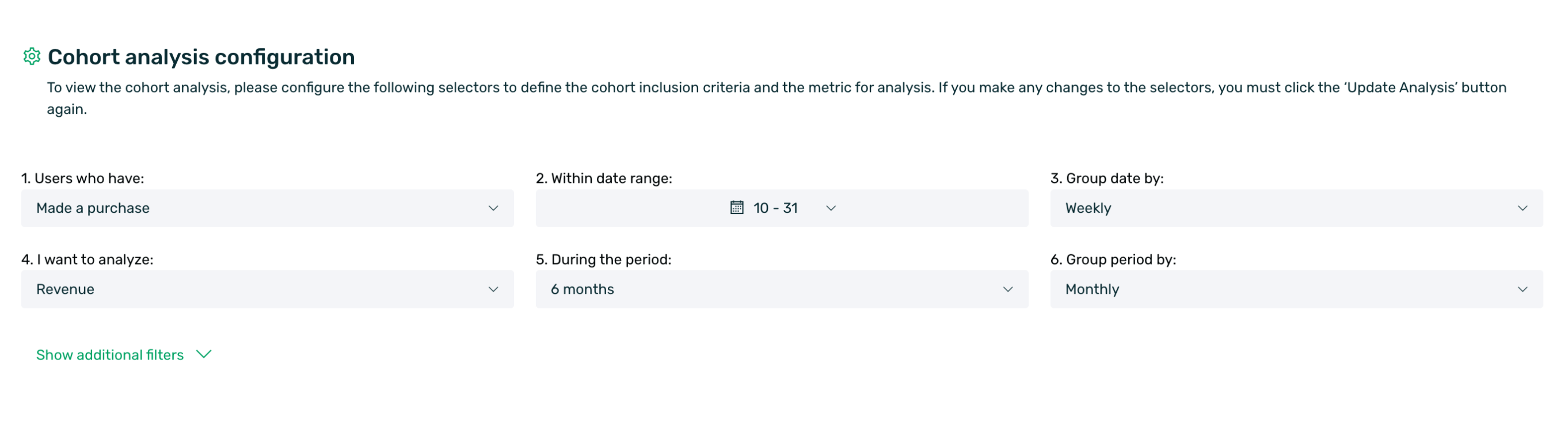
-
Inclusion criterion: Users who Made a purchase between the 10th and the 31st.
-
Cohort grouping: Dates are grouped by Weekly intervals.
-
Metric: Revenue is selected.
-
Lookback period: We will analyze the revenue generated over the following 6 months, with a Monthly grouping.
When analyzing revenue, the table interpretation differs slightly from retention analysis. Let's examine the first row of the results:
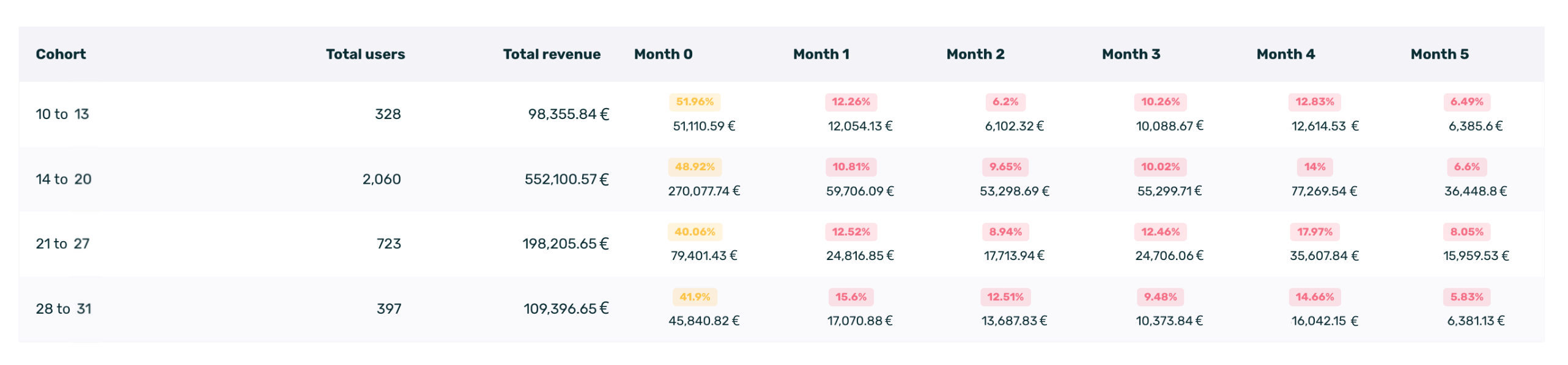
-
Cohort (10 to 13): This row groups users who made a purchase between the 10th and the 13th.
-
Total Users (328): There were 328 unique users who made a purchase during these dates.
-
Total Revenue (98,355.84€): This is the total cumulative value generated by these 328 users throughout the entire 6-month analysis period.
-
Month 0: 51,110.59€, indicating that more than half of the total revenue for this cohort was generated in the first month (51.96%).
-
Month 1: In the following month, these same users spent an additional 12,054.13€, representing 12.26% of the cohort's total accumulated revenue.
¶ Data export
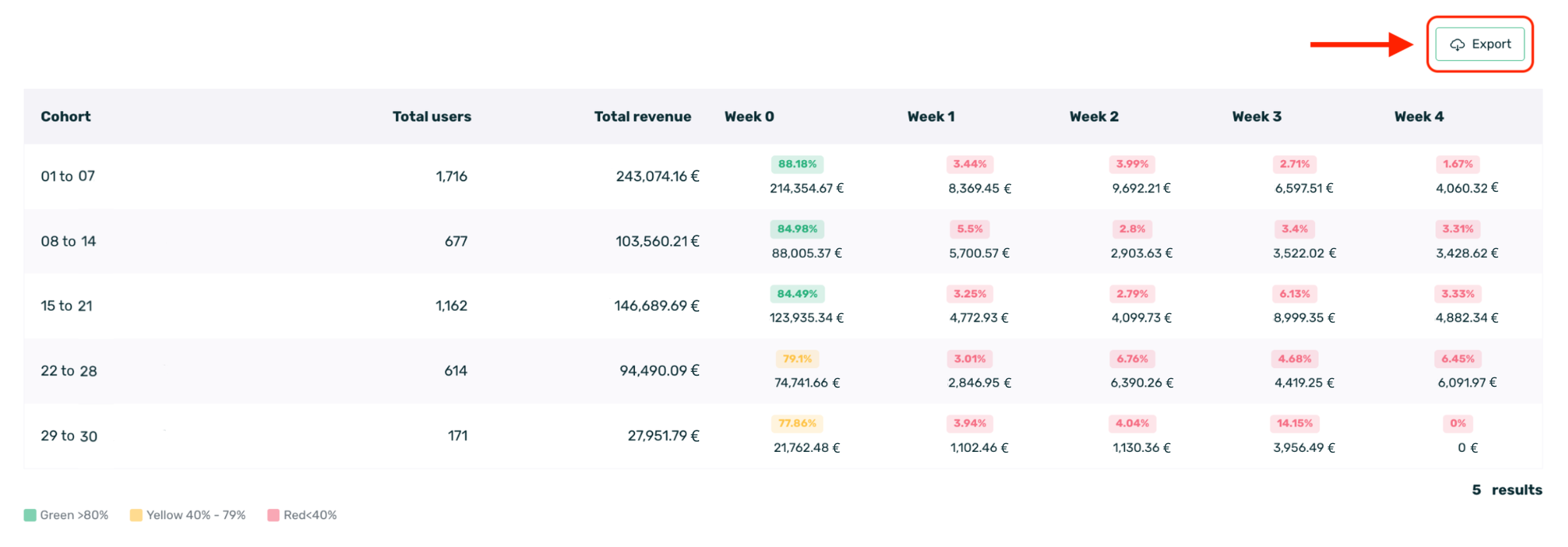
Should you need to process this data outside of EMMA, you can click the Export button located at the top right of the table. This will download a file containing the detailed numerical data, allowing you to integrate it into your own reports.